
A new map is up in the store, and it's a gorgeous look at a gorgeous and oft-overlooked part of the United States: Puerto Rico and the Virgin Islands in the 1920s.
Read MoreMaps for Puerto Rico
For the whole month October, all map sales will go to help fund relief efforts in Puerto Rico and the Virgin Islands. These aren't just some gorgeous maps; they're for a good cause.
Read MoreWhy good transit map design matters
Public transit is not just for people in big cities. All across the United States, public transit is a lifeline for millions of people who cannot afford a car or cannot drive. Unfortunately, these routes often provide the barest minimum of service: four round trips per day, no Sunday service, early end times. To add insult to injury, they are very rarely mapped in a comprehensible way, forcing riders to study dense timetables and obtuse maps.
To solve this problem in Tompkins County, New York, I created a frequency map indicating all stops, all routes, and major connection points.
One page from the rider guide
The existing maps are quite poor: there is no system-wide map, forcing riders to flip between pages to follow a single line along its course. Service levels aren't indicated, with weekend or late-night service shown as being just as important as weekday or high-frequency service. Often, new riders will avoid buses they don't know, even if the bus is going where they want to go, simply because there's no way to know where it will take them. Further, the local system, TCAT, has flag-stop service, where riders can get on or off a bus wherever the driver can safely pull off the road, but it is not indicated. In talking with riders, my team and I found people often didn't even know about the service. The existing maps' final sin is that it groups routes together on the same line even when those routes have nothing in common.
The same area as above, but in my redesign
The new map fixes each of these problems. It adjusts line thickness to indicate mid-day frequency; groups late-night and weekend routes together with their weekday counterpart routes (the 70 is the weekend counterpart of the 30, so these are combined into a single line); indicates flag-stop zones; and is envisioned as showing the full county's system in a single panel. For rural riders, for whom roads are critically important to wayfinding, the road grid is underlaid behind the entirety of the map.
I started a similar project a few years ago for Marin and Sonoma, but my design skills were simply too poor to finish. It taught me a lot, but, given the major changes since starting this project, I suspect I would need to start again. More interesting would be a better map of Bay Area transit service:
Bad design is not necessarily the fault of the transit agency - good designers are expensive and need management, and often staff and budgets are already too small. There is little time or energy to spearhead change. Still, they ought to consider the benefits that come from comprehensibly conveying the entirety of the system in one clear image.
Election Maps for November, 2016
As anyone who follows American federal politics knows, location can mean a lot when it comes to who votes for whom. Electoral maps on the local level are rather more rare, but no less informative. Here below are the maps of relative support for selected races and candidates from the November 2016 election. (1)
(You can click on the images for a bigger size and the PDFs are available, too, by request. Feel free to request more maps in the comments section. Note that this is not the final tally but one of the interim tallies. The exact levels of support may change a bit.)
President
Hillary Clinton won every single voting precinct in the county with at least 52 percent of the vote and Donald Trump got second place in all but two precincts, each of which are worth less than 100 voters. Rather than map first and second place, then, I wondered how the voting was distributed across the county.
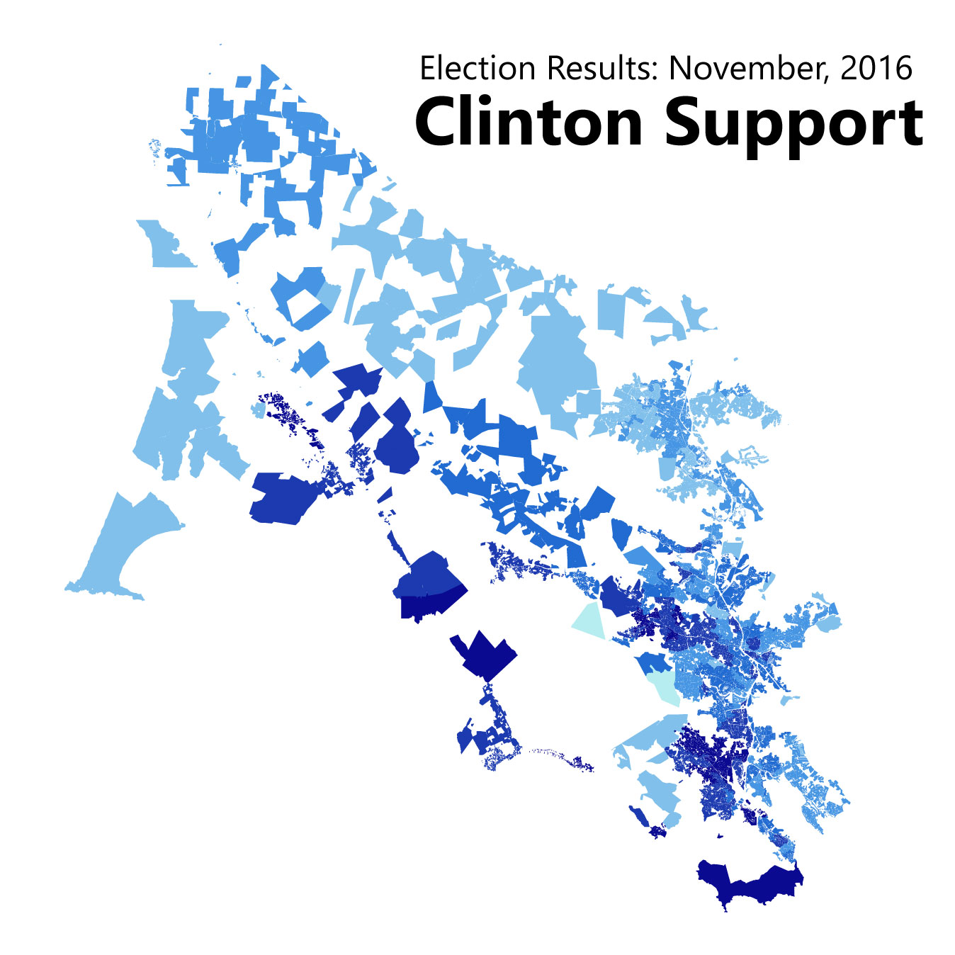
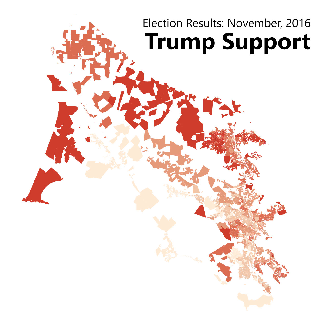
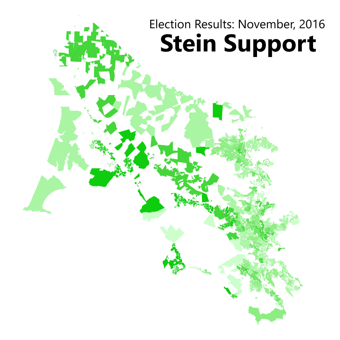
Tiburon, Blevedere, Ross, Corte Madera and Novato were the most conservative of Marin's cities, though in Marin that means voting for Clinton with 55-65 percent of the vote rather than 80 percent. Jill Stein did best in West Marin's villages and downtown San Rafael, and Trump did his best in Novato.
District 4 Supervisor
In Marin's marquee election, Dennis Rodoni beat out Dominic Grossi in second-round voting. Broadly speaking, Rodoni carried the northeastern half of the district with broad-based support in Woodacre, Dillon Beach, Novato, and a slice of Larkspur. Grossi took the district's southwestern half, getting support from San Rafael, Corte Madera, Mill Valley, and a handful of West Marin villages.
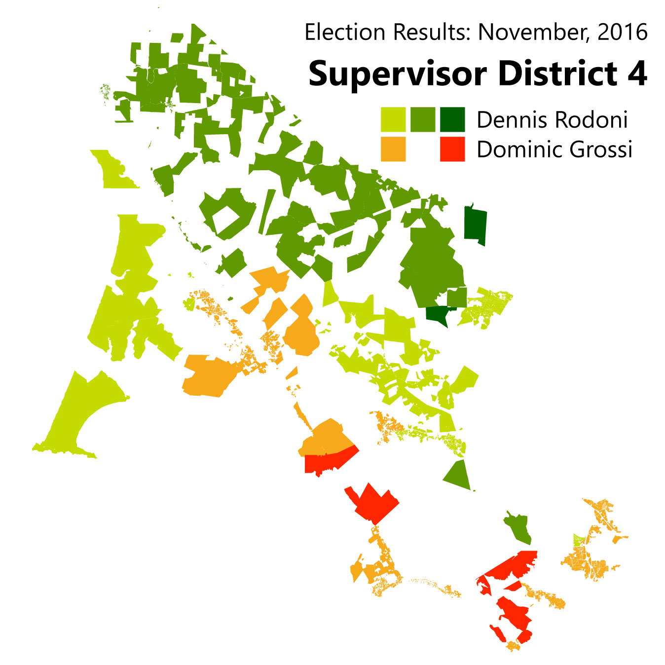
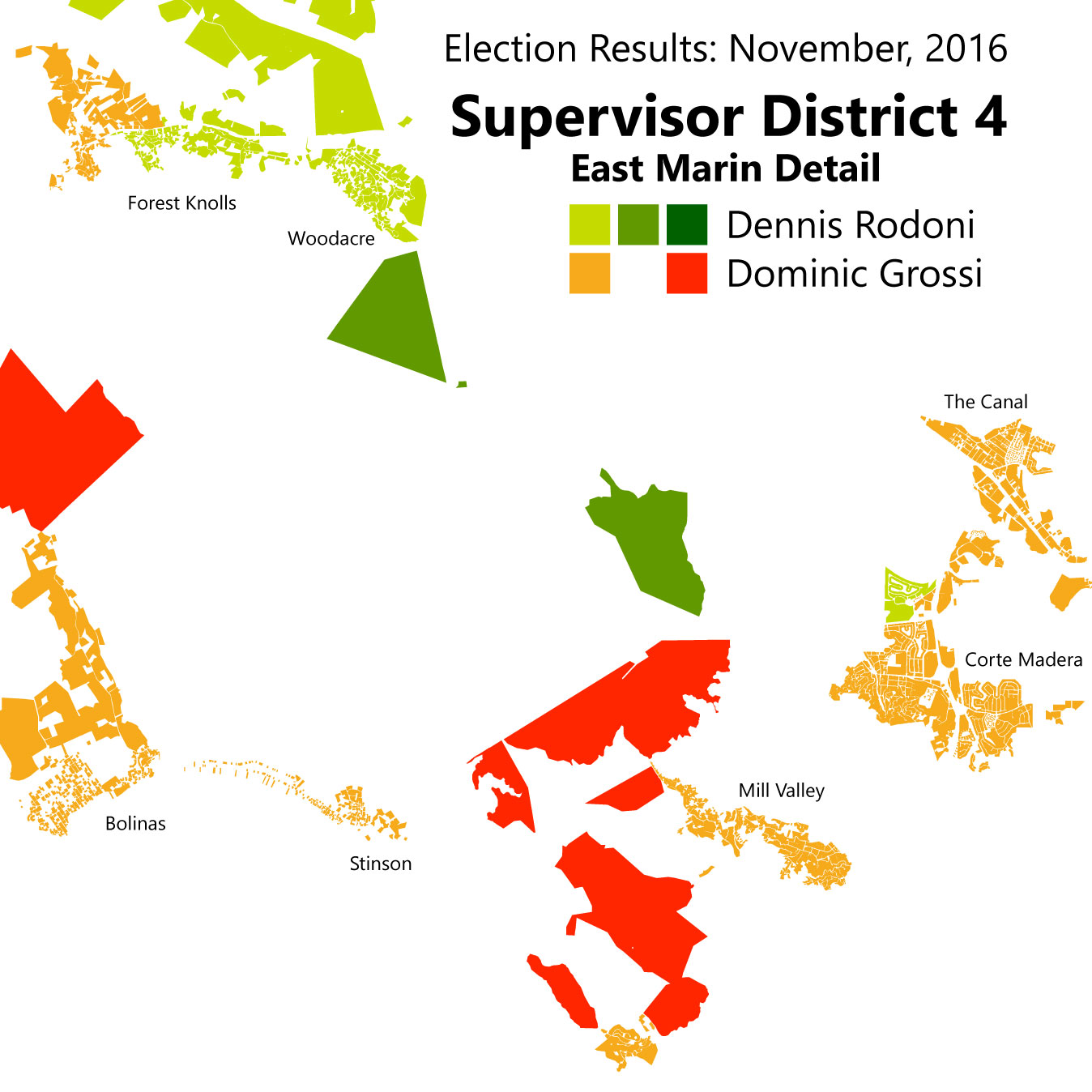
This mirrors the support received in the first round, indicating to me that there was not much convincing going on in the latter half of the campaign.
Proposition 64: Marijuana Legalization
As with Clinton support, no precinct in the county rejected the measure. That said, we can see that support for the measure largely followed the same lines as the presidential race: places that were cooler on Clinton were cooler on legalizing pot, and vice versa.

Measure A: "Strong Start" quarter-cent sales tax for child services
Marin's marquee ballot initiative was much more divisive. The measure, which would have passed a quarter-cent sales tax "to fund expanded preschool, child care and health services for low-income children in Marin," (2) did not pass. Though no precinct had less than half its voters supporting the initiative, because it was a new tax it needed a two-thirds majority. There is some of the liberal/conservative split seen in these results, but at first glance it looks bit more ambiguous than in the presidential election.
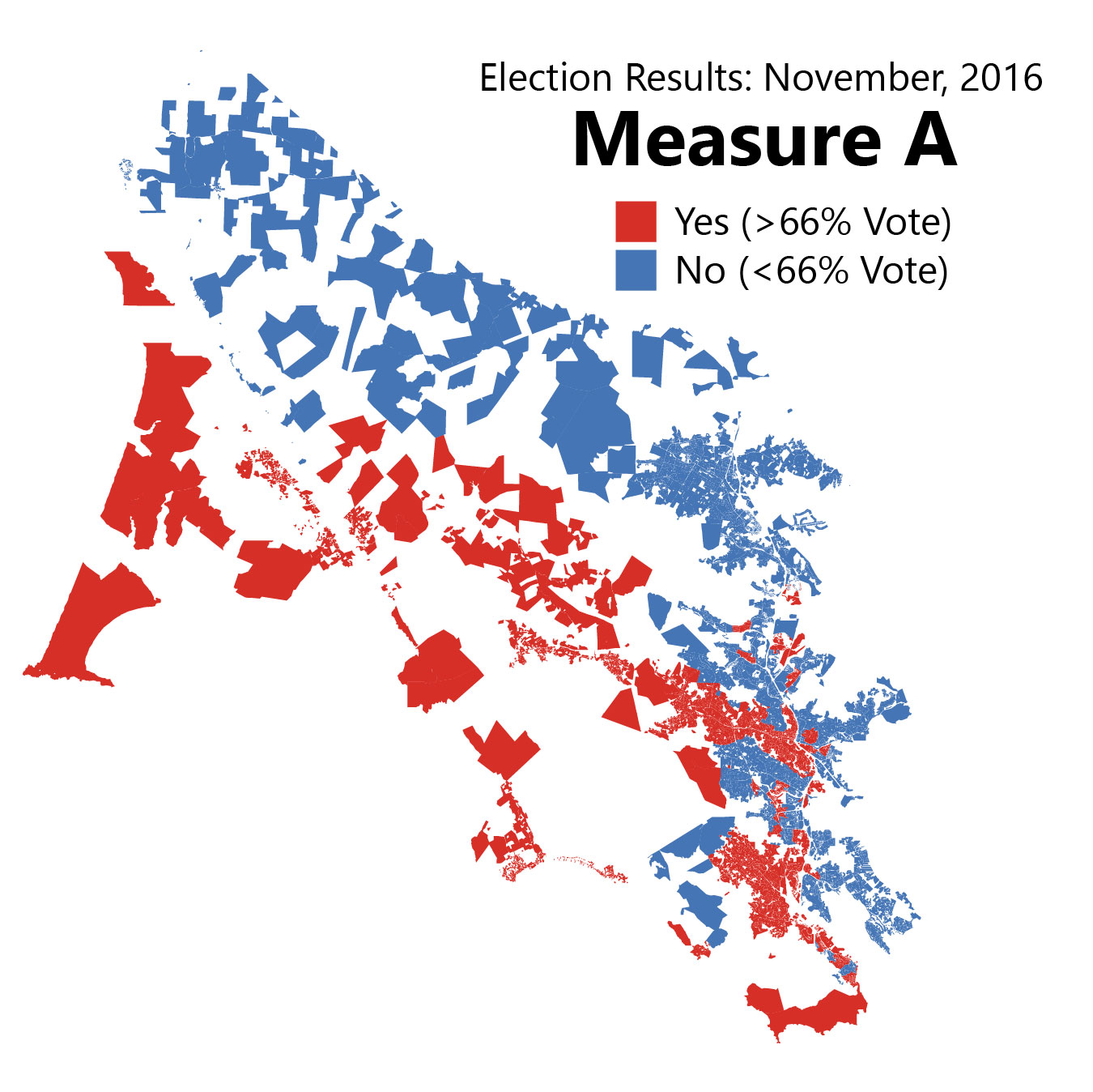
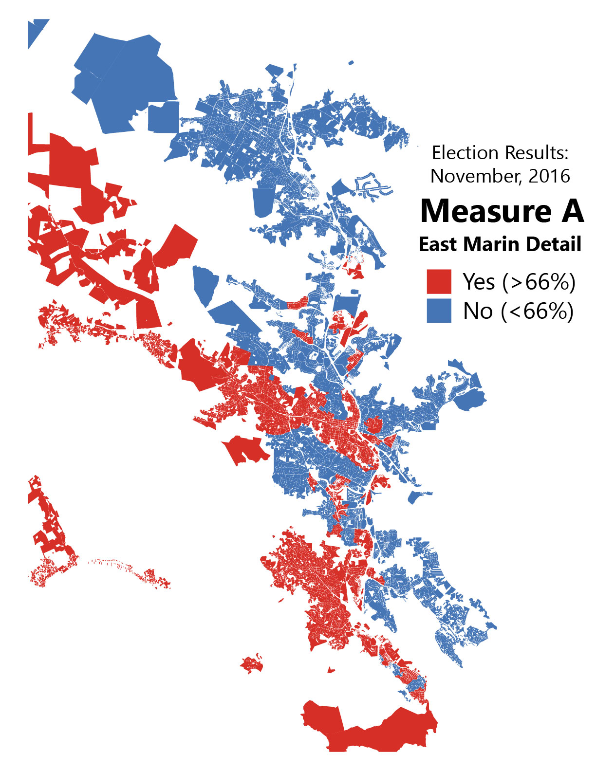
Look under the hood, however, and one finds a significant correlation between Clinton support and Measure A support. Here's that scatter-plot:

Basically, for every percentage of Clinton support in a precinct, that precinct also saw a half-point more support for Measure A. That's not a one-to-one match, but it is definitely there.
So Marin does seem to have something of an ideological split. Indeed, it may be possible to use Republican and ballot measure voting patterns to mark which areas are more or less liberal than the Marin County average. What to label this divide, of course, would be quite heated: both sides want to seem mainstream (and both are!) and being "conservative" in Marin is almost seen as a character flaw. Chime in in the comments if you have ideas ("populist" vs "progressive" or something?)
The core message of this post is that Marin does have politically diverse geography beneath the liberal veneer. Understanding it should be integral to any political outreach program.
1. Marin County Elections Department. November 8, 2016 General Election Statement of Votes Cast [Internet]. 2016 [cited 2017 Feb 7]. Available from: http://www.marincounty.org/depts/rv/election-info/past-elections/page-data/tabs-collection/2016/nov-8/sovc-listing-page
2. Halstead R. Marin voters face 11 tax measures on November ballot. Marin Independent Journal [Internet]. 2016 Aug 12 [cited 2017 Feb 7]; Available from: http://www.marinij.com/article/NO/20160812/NEWS/160819921
What if the Bay Area had never lost its railroads?
With the Northwestern Pacific reopening up soon as a limited commuter rail service - even though it need not - one wonders what the Bay Area would have looked like had it reinvested in its rail lines over the years rather than just rebuilt them. Well, it probably would look something like this:

Map by Theo Ditsek. Click to go to his post, where you can find a full-size image.
I am always pleased to see our region's transit system reimagined by others, but I'm especially happy to see Theo Ditsek, one of the internet's more prolific transit map hobbyists, tackle the Bay Area, and tackle it like he did. From what I can see, he didn't leave a single rail line unused: there are rail lines from West Marin to Sausalito, subways through San Francisco, commuter rail to Santa Cruz, and shuttle lines heading every which way. My favorite, though, is the railroad to Tahoe.
Perhaps my only complaint is the lack of rail links from Marin and Vallejo to San Francisco, both for commuters and long-distance travelers. Beyond this, however, it's a truly marvelous piece of work. Now if only I could get it as a poster...
Progress on the DC & Baltimore Map
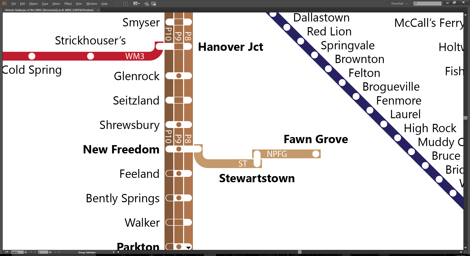
It’s been a while, clearly, but there is progress. I’m in final check-up and labelling, which is a long slog. Pennsylvania, Western Maryland, Maryland & Pennsylvania, and the ferries are done. I’m also finding out whether or not I missed some lines, and boy did I miss a biggie. First, the progress map:
![Historic-Railways-of-the-DMV-[Recovered].jpg](https://images.squarespace-cdn.com/content/v1/554110c7e4b0512f43ca0881/1452635654593-YY1MQ1M6GC1TW310JCPG/Historic-Railways-of-the-DMV-%5BRecovered%5D.jpg)
I had to re-do a couple of the river ferry lines to fit in the York River line. Mobjack Bay, which had ferry service to Norfolk, had to get cut. That’s fine, given the limitations of the map and the relative importance of getting to West Point from Baltimore compared to Mobjack service, but it’s a loss nonetheless.
I’ve also finished up the Pocomoke & Occohannock line, which was a true pain, with different service in either direction for almost every day of the week: 11 patterns in 7 days. Ugh.
Now, I’m on the final check-up: label all the lines coherently, color the lines appropriately, make sure there aren’t any spelling errors or misplaced lines or circles, and check to ensure all service is included. Labeling is some Excel work, which looks like so:
Percentages are the percent of times a train lumped into a given line will stop at that stop. It takes a lot of futzing to cut this down.
Alas that last thing, checking to ensure all service, is the Big Deal.
When I started the map, I was only going to do lines that started within the confines of the contemporary DC & Baltimore Metropolitan Area. As I went along, I decided it would be more important to show all the connections there is space for. As a result, there are a few lines I missed. Hagerstown & Fredericksburg, for instance, has the Northern and Williamsport divisions, which I’ve now added in, but more important is what happens around Wilmington.
Around Wilmington, I missed the Wilmington Division of the Philadelphia & Reading, the Pomeroy Branch of the Pennsylvania, and the Landenburg Branch of the B&O. These all interconnect with either one another or Pennsy’s Octoraro Branch or both, which means some crazytown geometry and a reworking of some of the first lines I drew. How fun. On the plus side, it means we’ll get to see every station in Delaware, so it’ll be the first complete state in this series. Yay! Here’s the geographic map of what I’m up to:
Roughly the area bounded by the red box: Chadd's Ford Junction to Avondale to Newark to Wilmington. The electric lines shown here aren't listed in the Official Guide to the Railways, so they don't get to be included.
I also found a whole new railroad that I hadn’t seen, the New Park & Fawn Grove:
So yes, folks, I’m plugging away. What’s done:
- Reviewed and labelled the Pennsylvania; Washington, Bandywine & Point Lookout; Maryland & Pennsylvania; Hagerstown & Frederick; Chesapeake Beach; Washington, Baltimore & Annapolis; Maryland, Delaware & Virginia; Western Maryland; and ferry lines
- Added the Stewartstown and New Park & Fawn Grove railroads
- The coastline
Here’s the to-do list in no particular order:
- Add a couple of barrier island inlets on the Atlantic seaboard of the Delmarva Peninsula
- Finish up the Wilmington Division of the Philadelphia & Reading, the Pomeroy Branch of the Pennsylvania, and the Landenburg Branch of the B&O.
- Review the B&O; C&O; Norfolk & Western; Potomac, Fredericksburg & Piedmont; RF&P; Southern; Washington & Old Dominion; and Philadelphia & Reading railroads
- Convert white label outlines to 80% transparent
- Fill in the western Virginia whitespace
- Add legend, list of service, and map title
Mapping the derelict lines of the Bay Area
The old railroads that once defined the Bay Area and the country at large are typically just hinted at. Some lines only operate freight; others, overgrown rails, but many are just sinewy lines on a parcel map. While we do have old maps showing where the rails were, these are rail maps, not service maps.
Some years ago, I used old timetables to create a service map of Marin’s Northwestern Pacific Interurban, which brought to life a system that has been gone for over 70 years. This year, I decided to do the same thing for the whole of the Bay Area, and I’m launching a Kickstarter to fund prints and maps of other regions of the country.
The first map, for the Bay Area, shows every train published in the 1937 Official Guide to the Railways that began within the 9-county Bay Area. After lines leave the Bay Area, the map shows their last convergence points before major hubs like Los Angeles. If you want a print, head on over to the Kickstarter page.
The maps makes clear how much of a legacy these old rail companies left to the region. BART’s southern East Bay lines largely follow the Western Pacific right-of-way, while Amtrak still follows the Southern Pacific, including the A5/A6 route to San Jose. The map also shows some of the oddities leftover from competition, like the parallel Amtrak and BART lines, sometimes just a few blocks from one another.
To the north, BART’s Bay Point line follows the Sacramento North, while its route to Richmond blends ATSF and Southern Pacific rights-of-way. Caltrain still runs on Southern Pacific track, as does ACE.
I don’t think anything runs on the dinky little Bay Point & Clayton right-of-way, which itself is a fun story.
If you like railroads, and you like cool maps, then you really will want to sponsor. Seriously, $40 is pretty good for a 24×24 poster.
I also have prints of my map of Marin’s Northwestern Pacific Interurban. Next up is the Washington-Baltimore region. I’m not sure what’s next, but I’m really excited to see what comes out of the mist.