With San Rafael seemingly on the edge of enacting council districts, now is a good time to reassess how elections work in Marin. Districts are a good step, but other reforms – especially ranked-choice voting – would make the process more equitable in every election.
Read More
New homes, even luxury homes like these, might just prevent displacement. Image Credit: Custis, Aimee. SW Waterfront from Ohio Drive. Photo, September 27, 2016.
New housing mitigates displacement? Seems like so.
It’s often assumed that new development pushes out poor people. But it seems as though development is actually slowing or halting the shrinkage of poor neighborhoods and drawing new low-income families into the city. At least, that’s what a first analysis of Census data shows between 2009 and 2014.
Read MoreHow to add strategy to TAM's Strategic Vision Plan
Friday is the last day to comment on the Transportation Authority of Marin’s (TAM’s) draft Strategic Vision Plan. Billed as the planning framework of the agency, the document falls far short of its aims, serving more as an extended mission statement than a reliable strategy or roadmap.
Read MoreCars use up too much damn space
A common misconception I face is that I don’t like cars. On the contrary, cars are a wonderful thing: they give us freedom of movement, allowing us to go where we want, when we want. They are mobile rooms, so we can keep our stuff relatively safe wherever we go. They are personal mobility tools for people who have trouble walking. They’re a fabulous invention. But they use up too much damn space for everyone to use them.
Image by the author.
Or, if you prefer, a diagram of the same, with each box sized according to the space used by a traveller in the mode:
The tiny boxes in the corner are, in descending size, bus (half full), bus (full), train.
[The data above assumes a Level of Service of D for pedestrians [1], bicycles [2], and cars [3]; 1.2 passengers average for cars; 1 passenger for other private modes; 66-passenger bus; and 2,000 riders on a 10-car subway train.* Bike parking assumes 2 spaces, the size of which were estimated from a 12,500-space bike parking garage in Utrecht [4]; car and motorcycle parking assumes 3 spaces, the size of which were estimated from planning documents [5a; 5b]; and bus parking assumes a typical maintenance and storage facility [6]. Road space assumes 11-foot-wide urban lanes and 12-foot-wide freeway lanes.]
Jarrett Walker calls is this a problem of geometry: a dense city cannot run on cars [7]. There just isn’t enough space for most people to use it as their primary mode of transportation. Buses, trains, bicycles, and walking all use less space, so they become primary. I’d argue this is not just a problem of dense cities but also of chokepoints within less-dense places.
The first thing I notice is how much parking is needed, especially for driverless and urban cars. It looks like over half the space needs for urban cars come from parking, and almost three-quarters of the driverless urban car needs are from parking.
The goal of transportation planners ought to be to maximize the usefulness of their space. Driverless cars will help cut down on road usage, but their parking needs will still eat up much of the landscape. Driverless taxis would help more, but to be as space-efficient as a half-full bus they would need an average load of 20 people, and at that point it’s more bus than taxi.
In comparison, a bicyclist uses just 7 percent the space of a driver in a city. Someone on foot uses less than 2 percent.
In practical terms, the various space-intensive modes travel should be the most rare ways of getting around, used for practical reasons by people with mobility issues, people who have unusually long or circuitous commutes, and people who have loads to move. Travel by other modes should be much more common, especially at times when a lot of people want to go to a relatively compact area of the region (like at rush hour). These other modes should be just as fast or faster than driving (accomplished by improving those other modes), and relying on them should not feel like a burden.
Far from making driving harder, inverting mode shares so driving becomes more rare would actually make driving easier and better by making other modes much easier and much better. There’s no reason to give away 2,300 square feet of space to every car traveler when 27 square feet by bus or 7 and a half feet by train would do just fine for most trips.
Footnote
* Trains are the only vehicle here that must operate in their own right-of-way. They can move around 50,000 people per direction per hour using realistic headways compared with 4,800 on buses in their own right-of-way. Without stops, which would approximate the other modes' metrics, a train could operate about twice as often and yield the 7.5 square feet needed per passenger indicated here. A parallel article would examine lane capacity, but that would necessarily exclude parking - a key factor in cars' inefficiency - and so this is not the place for that examination.
Works Cited
[1] “Current HCM Methodology,” in Pedestrian Level of Service Study, Phase I (New York, NY: New York City DCP, 2006).
[2] Dan Zhou et al., “Estimating Capacity of Bicycle Path on Urban Roads in Hangzhou, China” (Conference Paper, The 94th Annual Meeting of the Transportation Research Board, Washington, DC, 2015).
[3] Energy Facility Site Evaluation Council, “Appendix C: Transportation,” in Kittitas Valley Wind Power Project Draft Environmental Impact Statement (Olympia, Washington: Sate of Washington, 2004).
[4] Juliana Neira, “World’s Largest Bike Parking Garage Opens in The Netherlands,” Designboom, August 10, 2017.
[5a] “Design and Improvement of Parking.,” Section 19.26.040, Roseville Municipal Code, accessed August 18, 2017; [5b] Peter Croft, “Light Vehicle Sizes and Dimensions: Street Survey Results and Parking Space Requirements – Information” (Auckland, New Zealand: Land Transport NZ, December 2004).
[6] Division of School Support, “School Bus Maintenance Facility Planner” (Raleigh, NC: North Carolina Department of Public Instruction, February 2011).
[7] Jarrett Walker, “Does Elon Musk Understand Urban Geometry?,” Human Transit, July 21, 2016.
Ten homes is not enough
This past week, the IJ trumpeted 10 new affordable homes built in Novato, calling it “proof that Marin has room for affordable housing.” [1] These homes, which took 5 years to build, are undoubtedly welcome for their new owners, but the editorial makes a mockery of Marin’s housing crisis and the depth of the county’s need.
Over the past 7 years, Marin added about 785 homes – an increase of about 0.7 percent. [2] This might be impressive if it weren’t far outstripped by population growth of 4.4 percent, [3] six times faster than housing stock, or even more outstripped by jobs growth of 12.2 percent, [4] 17 times faster than housing stock.

Image by the author.
In that context, a 10-home project is impressive mostly because it increases Marin’s pitifully meager annual housing production by 10 percent, but it is a drop in the bucket compared to the crisis-level shortfall Marin is facing today.
If housing construction kept pace with job growth – never mind the regional housing need – the county would have added over 13,000 new homes, almost 2,000 per year. With inclusionary zoning, that would mean 400 affordable homes every year, not a mere 10 every 5 years.
This is a pace of construction that Marin is unlikely to ever meet, but it shows the sheer size of the hole we’re in. Marin doesn’t just need a few more homes; it either needs to increase its construction pace by an order of magnitude (or take active steps to hurt its economy and stop the creation of new jobs).
Celebrating the opening of 10 homes is great, and the work done by Habitat for Humanity is bold. But until we get to where this sort of opening is small potatoes, it’s like celebrating your D-average: nice, but also kind of sad.
Works cited
[1] Marin Independent Journal, “Proof That Marin Has Room for Affordable Housing,” Marin Independent Journal, July 31, 2017, sec. Opinion.
[2] US Census Bureau, “Building Permits Survey” (Washington, DC: US Census Bureau), accessed August 6, 2017.
[3] Ibid.
[4] Center for Economic Studies, “Quarterly Workforce Indicators” (Washington, DC: US Census Bureau), accessed August 6, 2017.
Let’s get into the weeds: a congestion charge plan for Marin
Last week, we discussed how tolling designed to eliminate congestion would improve travel times and improve the efficiency of our roads. [1] This week, we get a bit into the weeds about how such a plan would work.
How to eliminate congestion in the North Bay
Marin has four main entrances, three of which have significant rush-hour congestion: the Novato Narrows, Highway 37, the Richmond-San Rafael Bridge (RSRB), and the Golden Gate Bridge (GGB), with Highway 37 being the odd one out of the congestion game.* These congested gateways are a drain on people’s time and public resources. The Narrows is only moving 85 percent of the vehicles per hour that it could, the RSRB moves just 61 percent, and the GGB moves just 74 percent capacity.**
The entrances are all chokepoints, with few or no parallel routes, so they are ideal for tolling. The toll need to be charged both directions, so existing tolls on the GGB and RSRB would be cut in half: half heading inbound and half outbound.
A toll that eliminates congestion would allow another 4,380 vehicles per hour to move at rush hour, a staggering 35 percent increase over today's numbers.
To determine the exact amount a congestion toll ought to be, we need some pieces of information: the maximum number of vehicles per hour each road can move, also known as their flow rate; the existing flow at peak hour; the amount of demand there is at peak hours; how long the flow is congested; the length of the congestion; and the median income of the area. If all of this is known, then a little calculus is needed and then, voilà, the result. Unfortunately, with publicly available data it is very difficult to determine demand, so we need to work a little bit harder for a less precise number.
I wanted to find out how much extra time people were spending in traffic than they would if all the roads were at their maximum flow and how much that lost time is worth. Tie these elements together and we get some estimates. The Narrows needs a charge of about $5 ($108 extra per month), the RSRB needs $5 on top of its existing toll (, and the GGB needs $6 on top of its existing toll. Combined, these tolls would bring in an additional $102.4 million per year, which could be used to secure bonds of up to $1.3 billion (over 30 years at a 4 percent interest rate). For context, the Golden Gate Bridge brought in $129.5 million in toll revenue in the 2015/2016 fiscal year. [2]
Look regional
Because Marin’s transit system is part of a broader regional system of bridges and highways, any tolling plan would need to be regional in order to ensure that traffic doesn’t spill over onto some other road. As previously mentioned, Marin’s entrances have very few good roads and therefore can be fairly easily tolled. However, if Marin manages to unclog its traffic, East Bay commuters might try to cut through the county on their way to San Francisco. More drivers on Marin’s roads means higher tolls, and then Marinites and Sonomans would have to pay more than before. Any toll plan would need to be implemented across the whole region to ensure all the region’s freeways are used as efficiently as possible and nobody is charged too much.
Build equity into the toll
One of the oft-cited problems with charges like this is that it is regressive as it hurts the poor, who have more time than money, more than the rich, who have more money than time. I outlined a solution briefly last time, [3] but here it is worth fleshing out a bit more.
Carbon taxes are often structured in such a way so as to be revenue neutral, [4] so whatever income is generated is refunded to the users. However, an unclog-the-roads toll, like what’s proposed here, should be used to increase the tolled travel corridor’s capacity and so needs to provide a useful income. This could be done either by selectively exempting vehicles registered to poor drivers, but that would be logistically difficult. Instead, tolls should be a refundable state tax credit that phases out as income increases. (Refundable tax credits are refunded to the taxpayer whether or not she owes any money, and so they are always returned.) FasTrak, or whoever the vendor is, would inform their registered users every year how much they paid in congestion tolls, which the users could report on their taxes. Non-registered users, like tourists or infrequent users, would not get a form so they’d end up paying no matter their income.
It’s difficult to estimate how much of the toll income would be refunded, but given that drivers tend to be wealthier in general, especially in the suburbs, this may not be a significant portion of toll revenue. Should it become viable to issue monthly rather than annual refunds to poor drivers, it would likely encourage driving, which would in turn increase congestion. That would require higher tolls, offsetting the revenue lost to refunds.
Regardless, because the toll essentially is trading time for money, and the amount of time currently used up in traffic is worth about $102 million per year, that is roughly how much would come in from these tolls.
Next time, we will consider just what might be done with this revenue stream to make travelers lives better.
Footnotes
* Traffic from 37 does add to congestion on Highway 101 to the south, and congestion does regularly crop up on the road, but the MTC analysis this post relies on [5] reports very little congestion on the road itself. Without a proper traffic management analysis, it would be tough to say how these tolls would actually shift congestion around the North Bay.
** This is current peak-hour flow divided by optimal traffic flow. Optimal traffic flow is the maximum capacity of highway lanes [6]; peak-hour flow is from Caltrans [7].
Works Cited
[1] David Edmondson, “The Science of Traffic and Its Awfulness,” The Greater Marin, July 3, 2017.
[2] Golden Gate Bridge, Highway, and Transportation District, “Comprehensive Annual Financial Report,” Annual Report (San Francisco, CA: Golden Gate Bridge, Highway and Transportation District, 2016).
[3] Edmondson, “The Science of Traffic and Its Awfulness.”
[4] UNFCCC, “Revenue-Neutral Carbon Tax,” Momentum for Change, accessed July 4, 2017.
[5] Metropolitan Transportation Commission, “Time Spent in Congestion,” Vital Signs, accessed April 29, 2017.
[6] John D. Zegeer et al., “Default Values for Highway Capacity and Level of Service Analyses,” National Cooperative Highway Research Program (Washington, DC: Transportation Research Board, 2008).
[7] Division of Traffic Operations, “2015 Traffic Volumes on California State Highways” (Sacramento, CA: Caltrans, 2015).
Why good transit map design matters
Public transit is not just for people in big cities. All across the United States, public transit is a lifeline for millions of people who cannot afford a car or cannot drive. Unfortunately, these routes often provide the barest minimum of service: four round trips per day, no Sunday service, early end times. To add insult to injury, they are very rarely mapped in a comprehensible way, forcing riders to study dense timetables and obtuse maps.
To solve this problem in Tompkins County, New York, I created a frequency map indicating all stops, all routes, and major connection points.
One page from the rider guide
The existing maps are quite poor: there is no system-wide map, forcing riders to flip between pages to follow a single line along its course. Service levels aren't indicated, with weekend or late-night service shown as being just as important as weekday or high-frequency service. Often, new riders will avoid buses they don't know, even if the bus is going where they want to go, simply because there's no way to know where it will take them. Further, the local system, TCAT, has flag-stop service, where riders can get on or off a bus wherever the driver can safely pull off the road, but it is not indicated. In talking with riders, my team and I found people often didn't even know about the service. The existing maps' final sin is that it groups routes together on the same line even when those routes have nothing in common.
The same area as above, but in my redesign
The new map fixes each of these problems. It adjusts line thickness to indicate mid-day frequency; groups late-night and weekend routes together with their weekday counterpart routes (the 70 is the weekend counterpart of the 30, so these are combined into a single line); indicates flag-stop zones; and is envisioned as showing the full county's system in a single panel. For rural riders, for whom roads are critically important to wayfinding, the road grid is underlaid behind the entirety of the map.
I started a similar project a few years ago for Marin and Sonoma, but my design skills were simply too poor to finish. It taught me a lot, but, given the major changes since starting this project, I suspect I would need to start again. More interesting would be a better map of Bay Area transit service:
Bad design is not necessarily the fault of the transit agency - good designers are expensive and need management, and often staff and budgets are already too small. There is little time or energy to spearhead change. Still, they ought to consider the benefits that come from comprehensibly conveying the entirety of the system in one clear image.
Election Maps for November, 2016
As anyone who follows American federal politics knows, location can mean a lot when it comes to who votes for whom. Electoral maps on the local level are rather more rare, but no less informative. Here below are the maps of relative support for selected races and candidates from the November 2016 election. (1)
(You can click on the images for a bigger size and the PDFs are available, too, by request. Feel free to request more maps in the comments section. Note that this is not the final tally but one of the interim tallies. The exact levels of support may change a bit.)
President
Hillary Clinton won every single voting precinct in the county with at least 52 percent of the vote and Donald Trump got second place in all but two precincts, each of which are worth less than 100 voters. Rather than map first and second place, then, I wondered how the voting was distributed across the county.
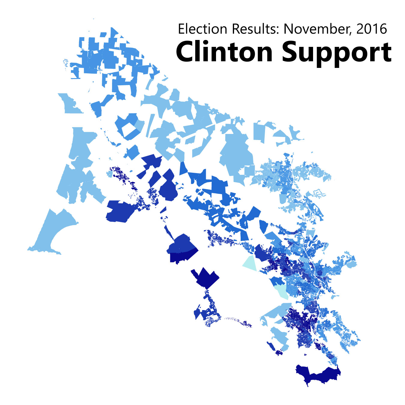
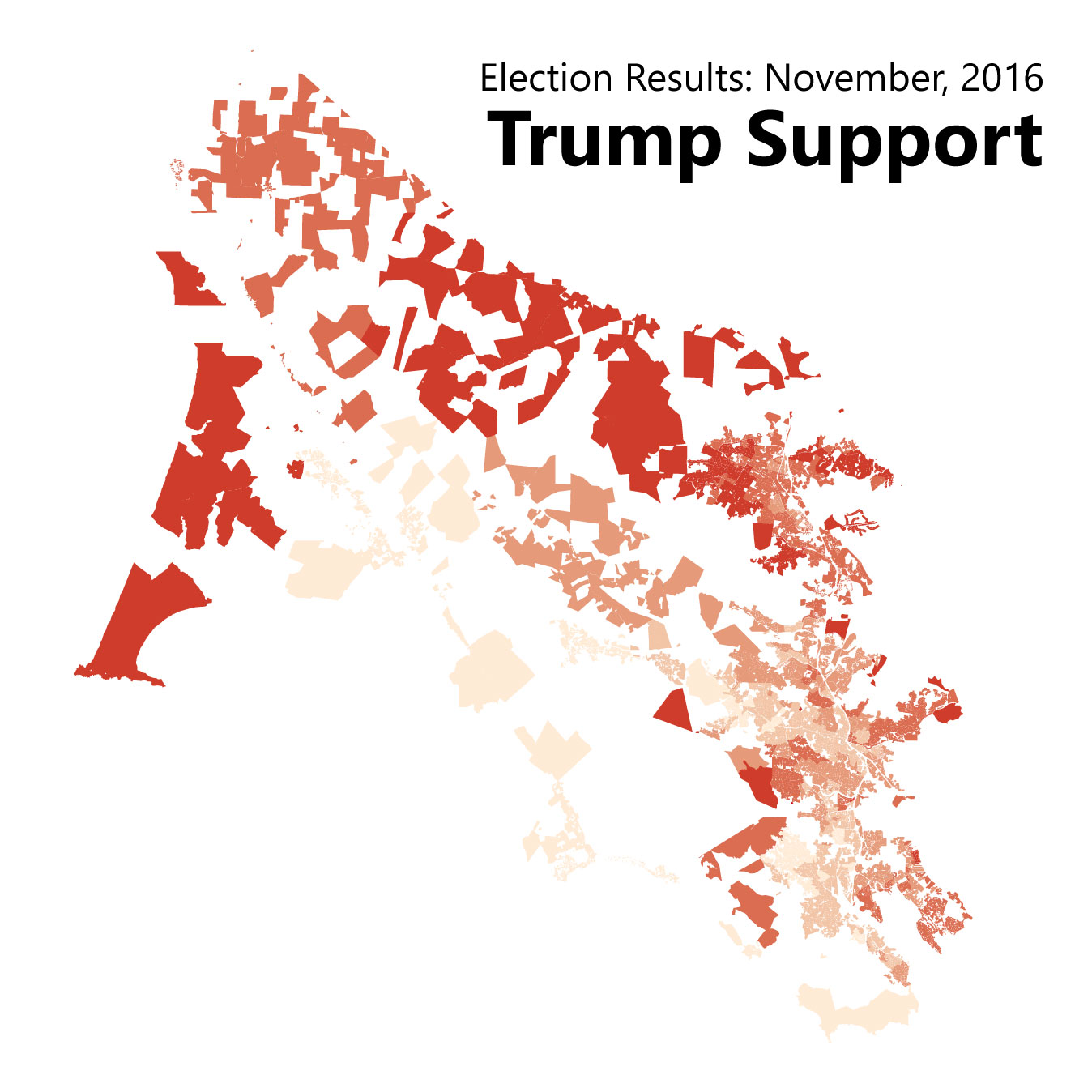
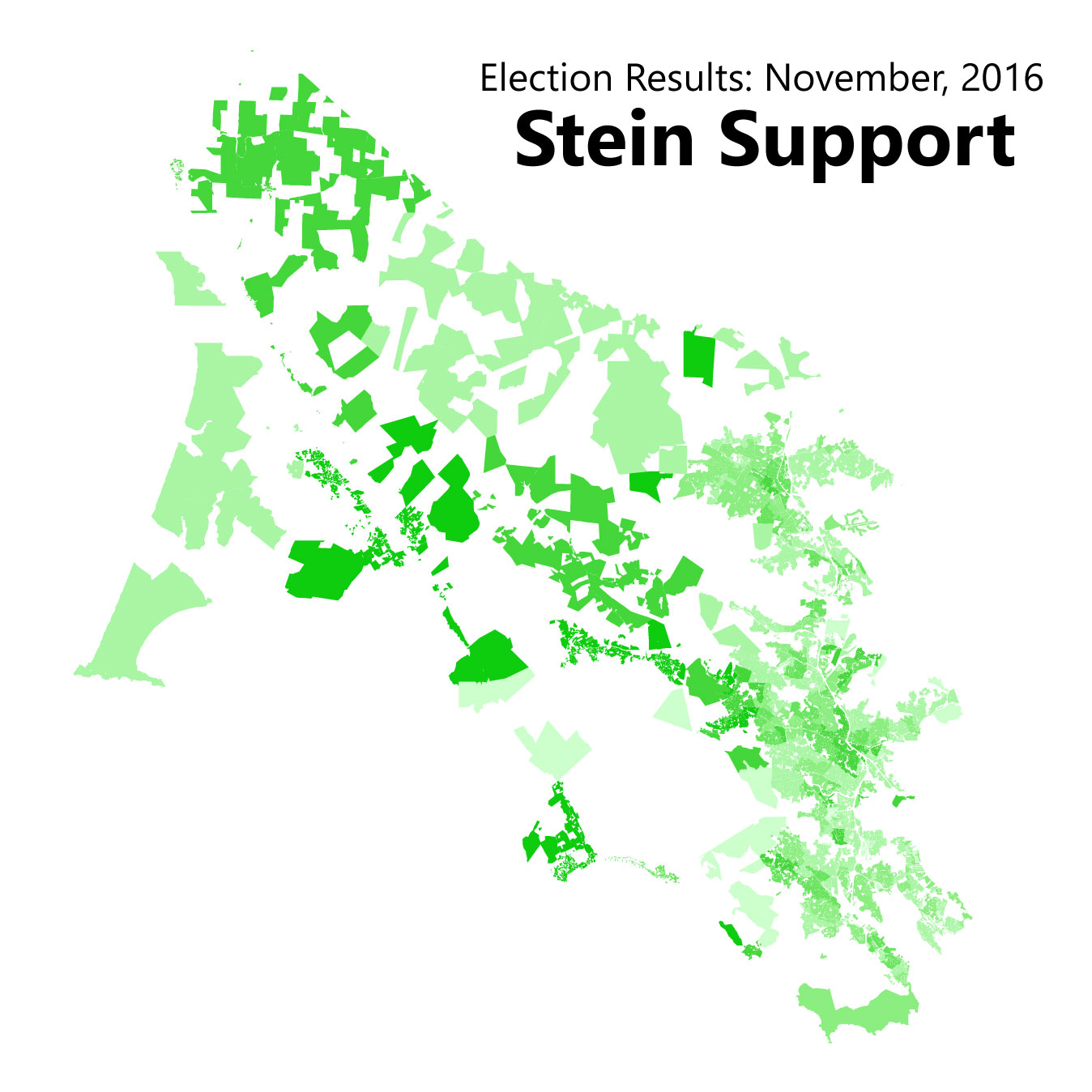
Tiburon, Blevedere, Ross, Corte Madera and Novato were the most conservative of Marin's cities, though in Marin that means voting for Clinton with 55-65 percent of the vote rather than 80 percent. Jill Stein did best in West Marin's villages and downtown San Rafael, and Trump did his best in Novato.
District 4 Supervisor
In Marin's marquee election, Dennis Rodoni beat out Dominic Grossi in second-round voting. Broadly speaking, Rodoni carried the northeastern half of the district with broad-based support in Woodacre, Dillon Beach, Novato, and a slice of Larkspur. Grossi took the district's southwestern half, getting support from San Rafael, Corte Madera, Mill Valley, and a handful of West Marin villages.
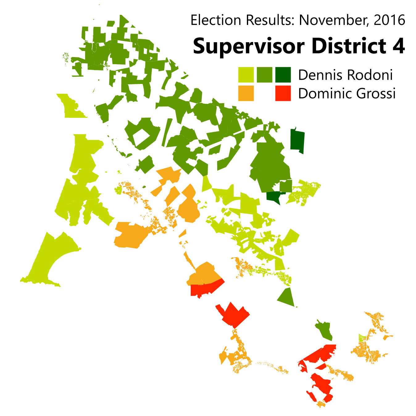
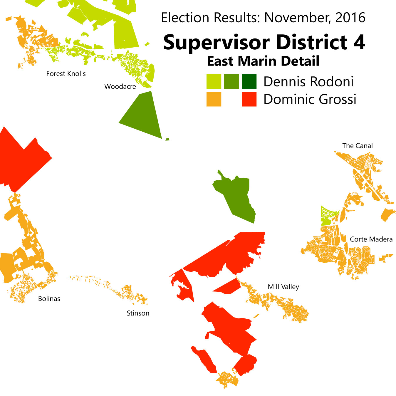
This mirrors the support received in the first round, indicating to me that there was not much convincing going on in the latter half of the campaign.
Proposition 64: Marijuana Legalization
As with Clinton support, no precinct in the county rejected the measure. That said, we can see that support for the measure largely followed the same lines as the presidential race: places that were cooler on Clinton were cooler on legalizing pot, and vice versa.

Measure A: "Strong Start" quarter-cent sales tax for child services
Marin's marquee ballot initiative was much more divisive. The measure, which would have passed a quarter-cent sales tax "to fund expanded preschool, child care and health services for low-income children in Marin," (2) did not pass. Though no precinct had less than half its voters supporting the initiative, because it was a new tax it needed a two-thirds majority. There is some of the liberal/conservative split seen in these results, but at first glance it looks bit more ambiguous than in the presidential election.
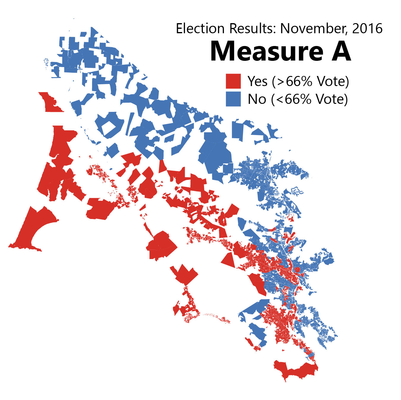
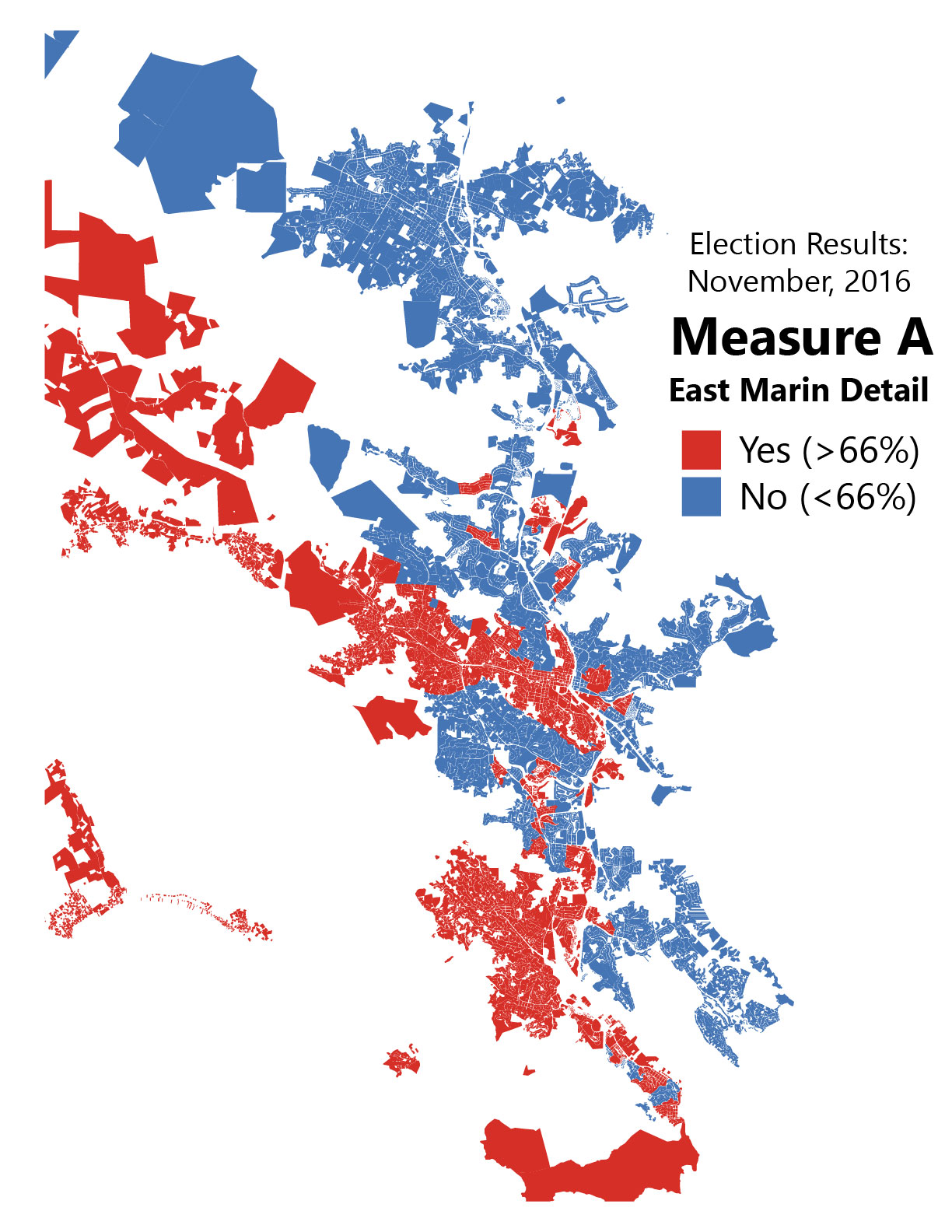
Look under the hood, however, and one finds a significant correlation between Clinton support and Measure A support. Here's that scatter-plot:

Basically, for every percentage of Clinton support in a precinct, that precinct also saw a half-point more support for Measure A. That's not a one-to-one match, but it is definitely there.
So Marin does seem to have something of an ideological split. Indeed, it may be possible to use Republican and ballot measure voting patterns to mark which areas are more or less liberal than the Marin County average. What to label this divide, of course, would be quite heated: both sides want to seem mainstream (and both are!) and being "conservative" in Marin is almost seen as a character flaw. Chime in in the comments if you have ideas ("populist" vs "progressive" or something?)
The core message of this post is that Marin does have politically diverse geography beneath the liberal veneer. Understanding it should be integral to any political outreach program.
1. Marin County Elections Department. November 8, 2016 General Election Statement of Votes Cast [Internet]. 2016 [cited 2017 Feb 7]. Available from: http://www.marincounty.org/depts/rv/election-info/past-elections/page-data/tabs-collection/2016/nov-8/sovc-listing-page
2. Halstead R. Marin voters face 11 tax measures on November ballot. Marin Independent Journal [Internet]. 2016 Aug 12 [cited 2017 Feb 7]; Available from: http://www.marinij.com/article/NO/20160812/NEWS/160819921
A high-frequency SMART corridor, revisited
In this week’s IJ Forum, guest and transit skeptic Richard Hall brought up something I didn’t expect: the argument that transit frequency equals freedom [1]. This is something that transit advocates have been harping on in Marin and elsewhere for years, and one of the key factors that is likely to hold back SMART from reaching its potential. Though I addressed this point back in 2012, with the train opening up this year it is worth revisiting how SMART might be able to reach higher frequencies, and how much it might cost.
There is blood in the single-track stone
Once operational, SMART’s trains will run in both directions simultaneously despite having only one track. It can accomplish this through the judicious use of passing tracks, meaning a strategic stretch of the corridor will be double-tracked so trains can pass one another.
At full build-out, from Cloverdale to Larkspur Landing, there will be 4 such passing tracks, each of which is 12 miles long, which will allow trains to run every 30 minutes in either direction. (This 30-minute time is called the “headway” in transit-speak.) To double the frequency to 15 minutes, we would need to double the number of passing tracks to 8. To double frequency again to 7.5 minutes, we would need to double the number of passing tracks again to 16.
At this point, the permanently single-tracked Puerto Suello Tunnel between North and Central San Rafael becomes the choke point. Any further increases would need to widen the Puerto Suello Tunnel and basically double-track the whole system. This would likely overkill for the foreseeable future.
Using the existing construction costs as a guide, the cost for the passing tracks on a 15-minute headway system is $60 million. The cost for a 7.5-minute headway system is twice that: $120 million [2]. If we include the cost of the trains needed to run such frequent service, the total cost would be $120 million and $307 million, respectively [3].
We can squeeze blood out of this stone if we are willing to spend the money for it.
Of course, ridership at this point becomes a problem. Is it worth it to run trains this often? Definitely.
There are almost 43,000 jobs and over 19,000 people within a half-mile of SMART’s stations. 2,237 people live and work within the station areas [4], but commute trips account for only about 20 percent of all trips, and this doesn’t include people who might use the park and ride services. Ballpark figures, using a ridership model [PDF] from the Transportation Research Board put the ceiling of SMART’s potential ridership at about 25,000 [5]. SMART itself estimates its ridership will be around 4,500 trips per day, which the model agrees with.
We need to dive a little bit into some wonky economics for a moment using these numbers but bear with me.
When a transit operator alters some aspect of a transit service, they of course also alter the ridership. Increase the vehicle speed and ridership goes up. Increase fares and ridership goes down. This is called the elasticity of demand: how much does a given change affect the demand for that transit service. The first example mentioned references the in-vehicle time elasticity because it indicates how much people change their habits based on how much time they spend in a vehicle. The second example is the price elasticity because it deals with the price of using the service.
Headways alter the access time elasticity, which is more valuable to people when it comes to transit. As much as you may enjoy your walk to the train, you probably enjoy the fact that you can work or sleep on the train en route a little bit more.
Access time elasticity among commuters is 1.28, which is pretty high. Decreasing average wait times by 1 percent by decreasing headways by 2 percent increases ridership by 128 percent [6]. Doubling SMART’s frequency to 15 minutes, then, will get us a 64 percent* increase in passengers: from 4,500 trips per day to about 7,380. Doubling frequency again could get us to 12,100 trips per day. This, of course, does not count the number of people who would use SMART for non-commute trips too, and it also ignores the effects of improving on the very infrequent service SMART is planning on providing in the middle of the day.
I would argue that a 15-minute frequency would absolutely be worthwhile on the basis of the commuters alone (the cost per new commute trip is $42,000, half the cost per trip on the baseline SMART system). A 7.5-minute system is not as cost-effective based on new commuters, but is significant if we include non-commute trips.
It may also be a viable alternative to a wider Novato Narrows. The traffic congestion there is in part due to a 15 percent increase in the number of cars travelling through to Central San Rafael, or roughly 500 more vehicles per hour [7]. Diverting 3,690 trips per rush hour (half of 7,380) would alleviate that congestion, at least until drivers fill up the space again thanks to induced demand [8].
So Hall is quite right on this point: transit frequency influences how people travel and how many people use the system. I am unsure whether he knew just how influential frequency can be, but no matter. SMART would do well to examine the effects of increasing its service frequency.
* Average wait times are half of the headway: if you arrive at a random point during the inter-train period, your average wait is half the full headway. Doubling frequency, then – a 100 percent increase – decreases average wait times by half that, or 50 percent.
Note: Given how off-topic any comments section can get in a SMART-focused article, I have turned them off for this post.
Works Cited
[1] Traffic in Marin, IJ Forums (San Rafael, CA, 2016).
[2] David Edmondson, “High SMART Frequency on the Cheap,” The Greater Marin, August 8, 2012.
[3] David Edmondson, “Can SMART Double-Track?,” The Greater Marin, August 6, 2012.
[4] Center for Economic Studies, “Longitudinal Employer-Household Dynamics” (United States Census, n.d.).
[5] Daniel G. Chatman et al., “Making Effective Fixed Guideway Transit Investments: Indicators of Success” (Washington, DC: Transportation Research Board, 2014).
[6] Arthur O’Sullivan, Urban Economics, 8th ed (New York, NY: McGraw-Hill/Irwin, 2012), 295.
[7] David Edmondson, “The 101 Corridor: Transportation Myopia in Practice,” The Greater Marin, January 13, 2013; Caltrans, “Traffic Volumes on California State Highways” (Sacramento, CA: Government of California, 2014).
[8] Connor Jones, “The Street Economics of Induced Demand,” The Greater Marin, December 21, 2015.
Supervisor races were all about geography
The June 7 primary election gave us political junkies a much-needed look at temperature of Marin County's electorate. In lieu of polls, it's easy to imagine the loudest voices are also the most politically powerful, but that doesn't seem to be the case this year. Instead, geography was destiny, with incumbents swinging to large victories in incorporated areas and challengers finding difficulty breaking out of their unincorporated enclaves. In West Marin, it was a classic case of North vs. South.
These maps were created using the First Count data released by the elections office on June 10. Full data counts won't be available until next week. A brief update will outline what changed once these data are released.
District 2: Katie Rice, Kevin Haroff, Frank Egger
Image by the author. Click to enlarge.
This election pitted incumbent Katie Rice against Larkspur councilmember Kevin Haroff and former Fairfax councilmember (now Ross Valley Sanitary District board member) Frank Egger. Haroff was endorsed by the Citizen Marin coalition and came out early against the Larkspur Station Area Plan. Egger orchestrated rezoning large chunks of downtown Fairfax to include more parking a few years ago and has called for more parking around Larkspur Landing.
First, Rice won every precinct and won the district with a whopping 57 percent. Nowhere did she earn fewer votes than her challengers. However, these two split the Citizen Marin vote, and there are areas where Rice won less than the combined totals of her challengers.
Rice was strongest in Gerstle Park, downtown San Rafael, and Larkspur, but would have likely lost Ross, Greenbrae, and northern Fairfax had she only faced one challenger. Egger was strongest in Fairfax, as he often is, but failed to make a good showing elsewhere. Haroff showed strongest in Ross and Greenbrae but did not do so well in his home city.
District 3: Kate Sears and Susan Kirsch
Image by the author. Click to enlarge.
Incumbent Kate Sears beat back a vigorous challenge from Citizen Marin co-founder Susan Kirsch who arguably started her campaign almost two years ago.
Strawberry vigorously pushed back against a then-years-old Priority Development Area, arguing it was a way for Sears to ram through new housing. Though that anger and resentment are largely in the past, its marks remain on this electoral stage, with Kirsch handily winning the Strawberry Peninsula and narrowly earning the support of nearby unincorporated neighborhoods on the Tiburon Peninsula.
Tam Valley/Homestead Valley/Almonte, home to Citizen Marin ally Sustainable TamAlmonte and numerous protests over Muir Woods tourists, however, went to Sears, as did all the incorporated towns in the district. Sears’ strongest support came from Marin City, possibly indicating that attempts to make inroads there by Kirsch and Community Venture Partners’ Bob Silvestri have not been terribly successful electorally. Sausalito, home to Citizen Marin allies and councilwomen Linda Pfeifer and Jill Hoffman, also went strongly for Sears.
District 4: The West Marin melee
Image by the author.
The chaotic 8-way race to replace Steven Kinsey resulted in a runoff between first-place Dennis Rodoni and second-place Dominic Grossi. No doubt the various endorsing bodies will be looking hard at the positions of both as progressive Wendi Kallins (frequently misspelled Wendy) and Citizen Marinite Al Dugan both failed to make the top two.
Rodoni, Grossi, and Kallins, along with 8th-place finisher Mari Tamburo, each claimed victory in at least one precinct. Rodoni’s support was concentrated in the urban areas of District 4, such as Larkspur and Novato; Grossi won the rural ranchlands of West Marin, as is befitting a rancher; and Kallins won her home of Forest Knolls, Olema, and San Geronimo. Dugan’s support, such as it was, came from East Marin, implying his platform of traffic and pension reform just don’t resonate out West.
EDIT: [A typo in my map reversed Rodoni and Grossi, which gives us an interesting chance at counterfactuals. Here's my alternative, corrected analysis:]
Rodoni, Grossi, and Kallins, along with 8th-place finisher Mari Tamburo, each claimed victory in at elast one precinct. Rodoni's support was concentrated in the township and urban areas of southern West and East Marin, including his home of Olema. Grossi won his home city of Novato and the more agriculturally-focused areas of northern West Marin, with just a few pockets of support in Southern Marin. In this first-round of results - we won't have the final vote tally until next week - Kallins won the central areas of West Marin in the San Geronimo Valley. Tam Valley was fairly evenly split.
Dugan support was strongly focused in East Marin, though he came in a distant fourth place. His support, such as it was, indicates his platform of traffic and pension reform just didn't resonate out West.
Intriguingly, Kallins seemed to be most in competition with Grossi, not Dugan, with a negative correlation between Grossi and Kallins vote shares. Dugan seems to have been a candidate on his own, with no clear negative correlation between his vote share and anyone else’s. He shares this in common with the other also-rans and Rodoni. This likely means that Grossi and Kallins split support. If Kallins supporters swing over to Grossi, he would be a formidible foe, able to command support of most of the incorporated areas of his district as well as the more populous pieces of West Marin. Rodoni would need to pick up not just Dugan supporters but many of the other also-rans to match. We will find out more as the Grossi and Rodoni campaigns gear up for the runoff in November.
If a pattern can be drawn, it is that Marinites reward competence and presence in their supervisors. District 4 residents rewarded supervisors with West Marin sensibilities. In Districts 2 and 3, their efforts or not, Kate Sears and Katie Rice have both been at the forefront of efforts to fix their districts' traffic. Yet this also cuts the other way: Strawberry and Greenbrae feel sidelined by their respective supervisors. Building trust will be difficult in these communities, but will be important: the superior organizing power of anger and aggrievement can make governing difficult even for an electorally safe politician.
Author's note: I am digitizing a huge amount of electoral data going back to 2013 for all races. If there is a race you would like to see mapped, let me know in the comments.
Author's other note: Unfortunately, Marin’s elections office does not keep shapefiles of electoral precincts, only lists of which residential properties belong to which precinct. This makes for unpleasant-looking maps, with holes and gaps where roads or uninhabited parcels are. But, short of redrawing hundreds of electoral precincts, it’s the best we have.
Bad shuttle routing will make SMART's last-mile problem worse
Shuttle service to SMART’s temporary north end will be winding, slow, and inefficient. That’s bad news for Sonoma’s towns, which are already under strain from car commuting.
Waiting for the Bus. Image by Franck Michel, on Flickr.
Sonoma County is getting passenger rail service for the first time in decades, hopefully starting at the tail end of 2016, with the opening of the SMART train.
SMART is starting to move from being an agency building a train, to an agency that will *run* a train. Big difference. Based on a lot of things I have heard in the past, there is concern that General Manager Farhad Mansourian is a better project manager CEO than an operations CEO. Time will tell, but as we approach the opening and decisions start to fall in place, I am going to reload this blog and follow the topic.
At last month's SMART board meeting, there was a presentation on First/Last Mile connectivity. The PDF is linked above, there is also avideo of this meeting - March 2, 2016 which is interesting and a bit illuminating. The board rightly gives the staff of SMART and the related agencies credit for a lot of hard work, but there are a lot of holes in the strategy which underscores that transit agencies and boards don't really focus test their ideas. They look at a problem, place themselves in the problem, and imagine how the problem needs to be solved. Witness Caltrain discussing workers who can go in "later" because they have "flexible" schedules. They go to work 8-5, my office doesn't even turn the lights on until 9 AM and people get upset at meetings before 10. The schedule isn't "flexible", it's flat out different.
With SMART, the board (mostly local politicians) and staff are working from a very "how do I get to San Francisco" mindset. I can't blame them, a lot of the public reacts this way as well, if you read internet comment boards. Officially, SMART diverges from this message on their website:
Today, more than 75% of commuters in the North Bay travel either within or between the two counties to get to work.
Thus we get to my first topic on the presentation on first/last mile - the North County Coordination to be provided by Sonoma County Transit. This connection is at the direction of the board and not negotiable - Windsor, Healdsburg, and Cloverdale were on the original proposed train line, and have had train service delayed indefinitely due to lack of funding. There is a bus from Cloverdale to Santa Rosa - route 60 - but it's slow compared to the freeway and doesn't go to the train depot on Airport Rd. SCT is going to add a shuttle - as seen in the first/last mile presentation, that will express between the 3 towns and the North SMART terminus at Airport Road. It will mostly run on US-101 in uncongested areas making it a quick connector. Sort of.
The proposed schedule shows the "go south in the AM, north in the PM" mindset of SMART. The only shuttles in the AM run North to South to meet trains, there are no proposed shuttles the opposite direction. One problem - the City of Healdsburg is a net *importer* of labor, not an exporter! SMART is trying to figure out how to get a small population of Healdsburg residents south, instead of the large population that is trying to get TO Healdsburg. The population shift during the day is such that tiny Healdsburg is starting to have parking wars and is now considering using valuable downtown land to build more parking.

Healdsburg has over 4,500 in-commuters and over 3,700 out-commuters. This relatively large shift in population for a town of just 11,000 during the workday is exacerbating housing and parking constraints.
Housing prices in Healdsburg are forcing the town's workforce to leave the city for Santa Rosa and Cloverdale, less expensive areas, which is bad on its own, but exacerbates the parking problem which leads to bad land use decisions which feedback to make the housing problem worse. That workforce could theoretically take SMART to the Airport and hop a shuttle to town, but it won't exist.
Not only does a northbound shuttle not exist, but the market of workers in Cloverdale who could take the shuttle to Healdsburg will be poorly served. The express shuttle will go from Cloverdale to Healdsburg in 20 minutes. SCT route 60 takes ~40 minutes to make the same run - the express cuts the trip in half and could attract new riders. However, because SMART and SCT are only thinking about "get people to the train" - the stop is located at the decrepit Healdsburg train depot on the outskirts of town (and they are building a $1 Million parking lot there), producing a walk for people making that trip which eats up any time savings. It also means that any tourists from SF who decide to take this route get dumped off in the middle of nowhere instead of the middle of town. Might as well drive. This in order to provide park and ride service to a bus for Healdsburg residents? The Healdsburg depot is out of the way for most Healdsburg residents, the bus will make an additional out of the way stop at the Windsor "Train Depot", before winding to Airport Road. Summary - any sane Healdsburger with a car will simply drive to the Airport Road Station.
The detour through HBG to get to the old depot, and the similar winding trip in Windsor kills the trip time, reducing any incentive for people coming from Cloverdale to use the shuttle. The buses should make quick stops just off the freeway but close to the downtowns - the Amtrak bus stop at Mill/HBG Ave in Healdsburg, and right off the freeway in Windsor next to where there is a McDonalds. Shuttle service like this relies on speed. Optimizing it is the only chance to get the ridership needed to keep the shuttle going and hopefully support the train. This includes understanding that some of the riders will eschew the train altogether, using the shuttle as a fast intra-North County bus service. And they should provide service in both directions at both peaks.
Original Post: Murphy, John. 2016. “SMART Train - Last Mile Connectivity - North County.” Holier than You Blog. March 31.
Other Works Cited
Healdsburg, CA. 2016. “Cerri Site (Purity Building) Redevelopment Project.” Healdsburg, California Official Site. Accessed May 29.
Mason, Clark. 2015. “Mass Evictions in Healdsburg Prompt Cries of Racism.” The Press Democrat, July 8.
Michel, Franck. 2014. Waiting for the Bus. Photograph.
Sonoma-Marin Area Rail Transit. 2016a. Board of Directors Meeting: March 4, 2016. Petaluma, CA.
———. 2016b. “First/Last Mile Connection.” Petaluma, CA, March 2.
U.S. Census Bureau. 2016. LODES Data. Longitudinal-Employer Household Dynamics Program.
Anti-urban groups fight to keep Drake congested
MAD: Fighting to make its logo a reality. Image from MAD. [1]
Despite years of arguing new housing will exacerbate traffic congestion and blaming the county’s urbanists for indifference to the problem of congestion, Marin Against Density (MAD) is now fighting against new traffic lanes on Sir Francis Drake (Drake), arguing the project will actually reduce capacity. Fact check: it won’t.
The project
Drake Boulevard is a mess south of Ross from every perspective. To people on foot or bike, it’s a hot, loud, dangerous traffic sewer. To people in cars, it’s a congested nightmare every rush hour. Thankfully, there’s enough space on the road to make the first problem a little less bad and fix the second problem.*
The biggest change to Drake would be a third lane heading south from Marin Catholic to 101 and, in one design, north from 101 to El Portal by narrowing lanes from between 15 and 21 feet to a standard 11 feet. This will increase capacity by about 50 percent along the most congestion stretches of the road, a huge boost for drivers that have complained about for years.
Other changes would be squaring off intersections in a few sections to make it safer to walk, new shoulders – formerly Class II bike lanes – and wider sidewalks [2]. Given that there are schools along the route, these are victories for parents and children along the way.
So what’s the problem?
According to an email from MAD [3], and to comments from anti-urbanists from the last time I tackled this problem in November [4], the primary complaint is that narrowing lanes will reduce capacity by slowing traffic. They’ve labelled it a traffic calming exercise, designed to support safety rather than traffic flow.
Even if we look past the morally reprehensible attitude that the safety of people walking isn’t worth protecting, it’s utterly illogical. MAD doesn’t understand how roads work.
A short primer on road capacity functions is in the notes, if you’re interested, but here’s the short of it: moving from a 12-foot lane to an 11-foot lane will decrease the free-flow speed of a road by about 3 percent, but adding a whole new lane will increase capacity much more than what’s lost by that very slight depression in free-flow speed. Add it all up, and the project should boost capacity by 45.5 percent.
But what about right-turn lanes lost? There is still more road capacity, so while the far right lanes might be slower during off-peak times, through drivers who won’t be in the far right lanes won’t need to worry.
To put it very simply, the county wants to slow uncongested travelers by about 3 percent to add 50 percent capacity. This seems like the kind of project MAD would support if it was so worried about traffic.
But MAD’s opposition to adding makes so little sense it boggles the mind. Why would an organization that argued any new homes will cause congestion fight against measures that might actually reduce congestion? The political answer might be the easiest.
It’s an election season, and that Fairfax email was rife with disparaging words for incumbent supervisor Katie Rice and glowing words for the conservative, Kevin Haroff, who has come out against the project [5]. By painting this redesign as a road diet rather than the road widening it is, MAD and its fellow organizations (CVP and Citizen Marin) can say that Rice has no solutions and is beholden to the madness of us urbanists.
If it’s about politics, then MAD is lying about the project to help their candidate and Haroff is complicit in the deception.
Of course, lots of anti-urbanists see a conspiracy to destroy Marin’s character. They probably actually believe that adding bike lanes is just part of that conspiracy. Al Dugan thinks I work for an anti-Marin lobbying group in DC, for instance.
So some people are playing the political game and don’t care if they’re on the technically correct side of a given issue or not as long as their candidate wins. Others want their candidate to win because they think only by cleaning house can they halt the spread of dangerous ideas in Marin. It’s a potent mix, and it‘s leading Marin down a dark path.
If even a project that will boost traffic capacity by nearly 50 percent is successfully painted as a congestion-causing project, there’s something seriously wrong with our politics. When we can’t even agree on what’s real or not, we cannot have a successful government. Fairfax went through this during Frank Egger’s years on the council. San Anselmo is going through its own turmoil with Ford Greene. Sausalito and Marinwood are going through phases when the whole governing body is dominated by people who take this sort of confrontational and personal approach to governing.
The Drake project has its problems, and I’ve highlighted them before, but as a symbol of our political dysfunction it is extremely worrying.
Notes
* For today, I’m not going to get into induced demand and the Fundamental Law of Traffic Congestion, which Connor Jones went over this past winter [6]. That’s a deeper problem, but fixing it is something nobody has the political stomach to take on even in San Francisco, let alone Marin.
Level of Service diagram, click to enlarge. Image from Wali Mamon.
** Traffic capacity – how many vehicles a road can carry in an hour – is a function of a road’s design speed and the road’s traffic jam density, or how many vehicles fit per mile when traffic speeds are basically zero:
Maximum Capacity = Number of Lanes × ((Free-flow Speed×Jam Density)/4)
This is called the Greenshields model, which is a reasonable tool for analyzing roads like this. Among other things, it tells us that as speed decreases, the number of cars the road can move per hour actually increases, at least up to a point. This is thanks to the fact that the space between cars decreases as speed decreases, allowing the road to be used more efficiently. Generally speaking, this is around Level of Service (LOS) grade E, though engineers try to keep LOS at around C or D to ensure some slack in the system [7].
According to this model, reducing the free-flow speed by 3 percent in this model to add a new lane will increase the maximum capacity by roughly 45.5 percent.
Works Cited
[1] Marin Against Density, MAD Logo, Digital Image, n.d.
[2] Kentfield Planning Advisory Board, “Sir Francis Drake Boulevard Corridor Rehabilitation” (Kentfield, CA, October 28, 2015).
[3] Marin Against Density, “Attend June 1 ‘Open House’ -- Forward This to Friends.,” June 1, 2016.
[4] David Edmondson, “Build Something Better on South Sir Francis Drake,” The Greater Marin, November 18, 2015.
[5] “Issues,” Kevin Haroff for Supervisor District 2, accessed June 2, 2016.
[6] Connor Jones, “The Street Economics of Induced Demand,” The Greater Marin, December 21, 2015; Connor Jones, “The Four Biggest Myths about Induced Demand,” The Greater Marin, January 4, 2016.
[7] Francis Vanek et al., Sustainable Transportation Systems Engineering: Evaluation & Implementation (New York: McGraw-Hill Education, 2014), chap. 7; Wali Memon, “Highway Level of Service,” October 12, 2012.
SMART Train alcohol policy comes up short
SMART wants to limit alcohol on its trains to only what patrons buy at the concessionaire. Experience from Caltrain shows that allowing riders to BYOB policy is not just good policy, but helps embed the system further into the culture of riders.

Caltrain riders hanging out. Image from SF2G.com
For 18 years I have ridden Caltrain - and in that time I have brought aboard and consumed hundreds of bottles and cans of beers, which I have enjoyed legally on the train. This includes frequent patronage of the semi-official Party Car formed by the cyclists on Caltrain.
Starting in 2000, alcohol consumption on Caltrain increased exponentially with the opening of AT&T park, home of the San Francisco Giants. Giants fans have flocked to the train, riding up the Peninsula with cases of beer and bottles of who knows what, safely being carried to and from the games. At some point, Caltrain decided to ban alcohol on trains running after 9 PM only IF there is an event - primarily Giants games but also Sharks games, concerts at AT&T Park, and now 49ers games and concerts at Levi's Stadium. That late, the consumption before and during the events reach enough of a pitch that it was prudent to put a limit on the policy. Over the years the train has also served hugely alcohol-fueled events like Bay to Breakers, Hardly Strictly Bluegrass, Octoberfests, etc... frequently on the same day.
Generally speaking, this open BYOB policy on Caltrain has been a success. Problems are generally very rare, given the nature of the train as primarily a commuter rail with a higher level fare. It has been an attraction to the train that has a nominal positive influence on overall ridership numbers.
At the end of 2016, I will start riding a new train line - the SMART train in Sonoma County. It will function as primarily commuter rail, running almost exclusively during peak commute hours, with a fare structure prohibitive to general miscreants, making it nominally similar to Caltrain, except that it will serve no special events like the Giants as there are no major sports or entertainment venues on the train line.
SMART has released their draft code of conduct for the train. It includes a policy of NO BYOB. They don't have a no alcohol policy because they have an operating theorem of having a bar car on the train. I am very disappointed by this policy - I find it rider hostile and that it will have a negative impact on the rider experience and overall ridership. While there will be a bar car - there are bar cars on the Amtrak Capitol Corridor too, but in a place like Sonoma County with an excellent selection of beer and wine, to limit riders to the meager selection of a bar car is misguided.
There is, of course, the suspicion that the rationale is not to prevent unruly behavior, but to support whatever vendor they get for their bar car. This is understandable, for the most part because the decision to put a bar car onto the trains is misguided at best. SMART put out a presentation on the bar car where they are toying with giving free rent to the vendor for a return of a percentage of the profits. This is predicated on the presumption that a bar car will turn a profit - my experience from the Amtrak Capitols is that the bar car is at best a loss leader, not a profit center. This is especially true when you consider that SMART has wasted valuable train space to build the bar car.
I personally think that the potential ridership of SMART should make it clear that the no BYOB policy is not in line with the overall goals of the train. They should reconsider this path and allow riders to bring their own beverages onto the train.
If you agree - please email SMART at info@sonomamarintrain.org.
Originally Published: Murphy, John. 2016. “SMART Train Alcohol Policy.” Holier than You Blog. May 18.
Dear Readers
I’ve been gone. Sorry about that.
After finishing up a tough second semester at Cornell University studying for a master’s in City and Regional Planning, I’m off to Manila, capital of the Philippines, for an internship with the country's Department of Transportation, so expect some dispatches from there.
On the upside, having a summer off means I’ll have more time to devote to Marin’s issues specifically, like the aftermath of the election (seriously, Citizen Marin/CVP/Marin Post? The best conservative you could find is Al Dugan?).
So what have been the big takeaways from my first year as a master’s student? First, that 11-foot wide lanes really are just fine for putting traffic through Sir Francis Drake Avenue. That a freeway, or a road, has the highest capacity at LOS D or E. That the only way to solve traffic congestion is with pricing.
That the Rawlsian ethical imperative for equity and a market urbanist philosophy actually can mix, and that the Bay Area is failing at both miserably.
I also found evidence, through a statistical analysis of Census data, that adding more homes to a given neighborhood allows it to hold onto its poor and middle-class populations better. So if you care about keeping gentrification at bay, you should build new homes, luxury and affordable alike.
And that one of the reasons the trains of the early 20th century aren’t really around anymore is because they were so damn slow, like less than 30mph slow, and the companies didn’t realize the point of transportation is transportation, not luxury.
Speaking of old trains, in between classes I finished up the Map of the Mid-Atlantic, a Cleveland frequent bus map, and started work on a Saint Louis of 1921 map.
I have a couple of papers to adapt to blog posts here, including that statistics analysis, and also some that I promised long ago that still have not been published. Given that on Thursday I’ll be flying for more than 19 hours, I will hopefully get some stuff done for once.
- David
Progress on the DC & Baltimore Map
It’s been a while, clearly, but there is progress. I’m in final check-up and labelling, which is a long slog. Pennsylvania, Western Maryland, Maryland & Pennsylvania, and the ferries are done. I’m also finding out whether or not I missed some lines, and boy did I miss a biggie. First, the progress map:
![Historic-Railways-of-the-DMV-[Recovered].jpg](https://images.squarespace-cdn.com/content/v1/554110c7e4b0512f43ca0881/1452635654593-YY1MQ1M6GC1TW310JCPG/Historic-Railways-of-the-DMV-%5BRecovered%5D.jpg)
I had to re-do a couple of the river ferry lines to fit in the York River line. Mobjack Bay, which had ferry service to Norfolk, had to get cut. That’s fine, given the limitations of the map and the relative importance of getting to West Point from Baltimore compared to Mobjack service, but it’s a loss nonetheless.
I’ve also finished up the Pocomoke & Occohannock line, which was a true pain, with different service in either direction for almost every day of the week: 11 patterns in 7 days. Ugh.
Now, I’m on the final check-up: label all the lines coherently, color the lines appropriately, make sure there aren’t any spelling errors or misplaced lines or circles, and check to ensure all service is included. Labeling is some Excel work, which looks like so:
Percentages are the percent of times a train lumped into a given line will stop at that stop. It takes a lot of futzing to cut this down.
Alas that last thing, checking to ensure all service, is the Big Deal.
When I started the map, I was only going to do lines that started within the confines of the contemporary DC & Baltimore Metropolitan Area. As I went along, I decided it would be more important to show all the connections there is space for. As a result, there are a few lines I missed. Hagerstown & Fredericksburg, for instance, has the Northern and Williamsport divisions, which I’ve now added in, but more important is what happens around Wilmington.
Around Wilmington, I missed the Wilmington Division of the Philadelphia & Reading, the Pomeroy Branch of the Pennsylvania, and the Landenburg Branch of the B&O. These all interconnect with either one another or Pennsy’s Octoraro Branch or both, which means some crazytown geometry and a reworking of some of the first lines I drew. How fun. On the plus side, it means we’ll get to see every station in Delaware, so it’ll be the first complete state in this series. Yay! Here’s the geographic map of what I’m up to:
Roughly the area bounded by the red box: Chadd's Ford Junction to Avondale to Newark to Wilmington. The electric lines shown here aren't listed in the Official Guide to the Railways, so they don't get to be included.
I also found a whole new railroad that I hadn’t seen, the New Park & Fawn Grove:
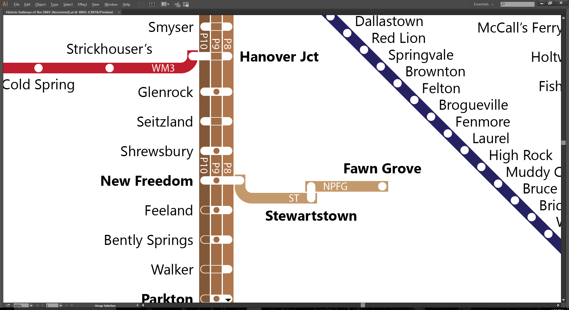
So yes, folks, I’m plugging away. What’s done:
- Reviewed and labelled the Pennsylvania; Washington, Bandywine & Point Lookout; Maryland & Pennsylvania; Hagerstown & Frederick; Chesapeake Beach; Washington, Baltimore & Annapolis; Maryland, Delaware & Virginia; Western Maryland; and ferry lines
- Added the Stewartstown and New Park & Fawn Grove railroads
- The coastline
Here’s the to-do list in no particular order:
- Add a couple of barrier island inlets on the Atlantic seaboard of the Delmarva Peninsula
- Finish up the Wilmington Division of the Philadelphia & Reading, the Pomeroy Branch of the Pennsylvania, and the Landenburg Branch of the B&O.
- Review the B&O; C&O; Norfolk & Western; Potomac, Fredericksburg & Piedmont; RF&P; Southern; Washington & Old Dominion; and Philadelphia & Reading railroads
- Convert white label outlines to 80% transparent
- Fill in the western Virginia whitespace
- Add legend, list of service, and map title
The street economics of induced demand
This post, by Connor Jones, originally appeared on Urbanist.co. In keeping with The Greater Marin's style, in-text citations have been added.
There’s a lot of misinformation out there about induced demand (Littman 2015), a widely established city planning model that attempts to explain why cities tend to maintain a steady state of congestion. I’ll go into some more detail on the theory of induced demand later, but I wanted to start with the economic model.
Image by Connor Jones, Urbanist.co
Auto transportation market
The amount that people drive is determined by market forces of supply and demand. Consumer preferences about driving are provided by the demand function, which shows that drivers choose to drive less as the cost of driving increases. Conversely, the supply function is a representation of the existing stock of roadways. In this case, the cost of auto travel is congestion.
Model Assumptions
The principle assumption is that the primary variable cost of auto travel is the time it takes to get from point A to point B, which is reasonable since the fixed cost of owning a car far outweighs the cost of gas for a majority of consumers. (Consider a worker who makes $15 an hour full time. An increase in average commute times by 12 minutes per day decreases his income by $750 a year—the equivalent of a 2.5 percent pay cut.) Even so, the price of gas does factor into people’s driving decisions, so we have to assume that the price of gas is constant. Furthermore, we assume that consumers’ driving preferences are constant. (More on this assumption later.)
Mechanics
The most common justification cited for building a new roadway is to reduce congestion, which makes sense. Most localities will commission a traffic study, which frequently assume constant growth of drivers and therefore also congestion.
Induced demand shows a different story, however. According to our model, the increase in the stock of roadways shifts the supply curve out, which does, in fact, reduce congestion in the short term, but, not as much as it would were there not growth in the number of vehicle miles traveled. Since the cost of driving is reduced, drivers both make longer and more frequent trips in the short term. As we can see from our graph, the number of vehicle miles traveled increases from q1 to q2.
In the long term, the reduced congestion encourages the construction of less dense housing developments far from the city center. With the new roadway, commuters can live farther from their places of work and leisure at the same cost. Over time, these developments shift the demand curve out, reducing the gains against congestion and further increasing the number of vehicle miles traveled.
The effect on cities
The auto transportation market explains the intuition that building more freeways makes a city more car-dependent and encourages sprawl. In very many documented cases (which I will summarize on Friday), building a new roadway does not reduce congestion for very long. Cities that invest in auto infrastructure do not see improvement in congestion (Gehl 2010).
What traffic engineers assume
According to Jeff Speck in Walkable City (which I’m still reading), traffic engineers commonly assume that demand for roads will increase at a constant rate, year over year (2013). With that assumption in place, you can see how they could come to the conclusion that a new freeway will improve congestion in the long term. The market movement without induced demand is illustrated below.
Image by Connor Jones, Urbanist.co
The conclusions reached are vastly different. Under these assumptions, after opening the freeway, there is no increase in vehicle miles traveled (which is not corroborated by real-world data.) The reduction of congestion is larger than the induced demand model predicts, and the only growth in demand is independent on roadway growth.
Caveats
The relative sizes of the movements along the curves will vary depending on the slope of the demand curve (which is dependent upon consumer preferences, which vary from place to place). We will examine the variation in the relative effects of induced demand later this week.
Public policy implications
Government-supported roads are effectively subsidies for motorists. Without as much investment in roads, the free market would have a greater incentive to create public transportation and dense housing options in city centers. For this reason, the enemy of the walkable city is the six-lane freeway. As I have argued before (and will no doubt argue again), walkability serves several public policy goals at once (Jones 2014a).
Works Cited
h/t to Jeff Speck’s Walkable City, where I found much of this information. All resources:
Federal Highway Administration. 2012. “Induced Travel: Frequently Asked Questions.” Office of Planning, Environment, & Realty (HEP). December 3. http://www.fhwa.dot.gov/planning/itfaq.cfm#q4.
Gehl, Jan. 2010. Cities for People. Washington, DC: Island Press.
Jones, Connor. 2014a. “Want to Reduce Reliance on Foreign Oil? Start with Walkability.” Urbanist.co. June 12. http://urbanist.co/want-reduce-reliance-foreign-oil-start-walkability/.
Littman, Todd. 2015. “Generated Traffic and Induced Travel: Implications for Transport Planning.” Victoria, BC: Victoria Transportation Policy Institute. http://www.vtpi.org/gentraf.pdf.
Mann, Adam. 2014. “What’s Up With That: Building Bigger Roads Actually Makes Traffic Worse.” Wired, June 17. http://www.wired.com/2014/06/wuwt-traffic-induced-demand/.
Schmitt, Angie. 2012. “Report: Traffic Studies Systematically Overstate Benefits of Road Projects.” Streetsblog USA. July 6. http://usa.streetsblog.org/2012/07/06/report-traffic-studies-systematically-overstate-the-benefits-of-road-projects/.
Speck, Jeff. 2013. Walkable City: How Downtown Can Save America, One Step at a Time. 1st edition. New York: North Point Press.
Original Post
Jones, Connor. 2014b. “The Street Economics of Induced Demand.” Urbanist.co. June 25. http://urbanist.co/street-economics-induced-demand/. Reposted with permission.
A case for the comprehensive bike network
A couple of weeks ago, commenters were largely negative to the idea of protected bicycle lanes on Sir Francis Drake Boulevard for safety reasons and for the reason that the Corte Madera path already existed. But why should we build protected bicycle lanes along high-speed corridors at all? The weight of evidence says it would be of great benefit to cycling in the county generally and to our high-speed corridors specifically.
Network effects
In the Kentfield-Greenbrae corridor, the cycling network is incomplete. The Corte Madera Creek path is a wonderful segment of that network, but it only works for some people. For anyone living north of Sir Francis Drake – yes, there are plenty of flat, bike-friendly streets – that path is useless for getting around the neighborhood. Often, staying off Sir Francis Drake doubles trip times, something no driver would be willing to do.

This holds true for other corridors, and it’s not surprising. Since the rise of the car, arterial roads have become the backbone of our commercial economy. Quiet streets are saved for our showpiece downtowns and residential neighborhoods while high-speed roads serve our everyday shops, like supermarkets, banks, retailers, doctor’s offices, post offices, coffee shops, and the like. By pushing bikes off the high-speed streets, we effectively take biking off the list of acceptable ways to get around for everyday errands.
And there are the benefits of network effects. Though each individual project might not add much to bike ridership, building a complete network will mean every completed segment will add to the usefulness of every other segment. One fax machine is a paperweight. A fax machine in every office, however, makes that one machine very useful. A new safe bike lane on Sir Francis Drake is useful to those living near it. Another one on Corte Madera’s Tamalpais Avenue is useful to those living near that street.
Add a link to Redwood Highway and suddenly you have a network, making both Tamalpais Avenue, Redwood Highway, and Sir Francis Drake useful to anyone along any of those routes while also adding value to the Corte Madera Creek path and the Sandra Marker trail. Any other links – like Bon Air Road or San Anselmo’s Red Hill Avenue – expand the capabilities of the formerly isolated segments even further.
This is backed up by research. Jessica Schoner and David Levinson of the University of Minnesota found that “connectivity and directness are important factors in predicting bicycle commuting after controlling for demographic variables and the size of the city” (Schoner & Levinson, 2014) Since commuting is a minority of trips, and these high-speed roads are also lined with shops and services, the effect on overall trips by bicycle will be larger than expected.
As well, Schoner and Levinson didn’t differentiate between the quality of the bike link, whether it’s a painted bike lane, an off-road path, or a protected lane like what I propose. Other studies (Heinen, Maat, & van Wee, 2011; Tilahun, Levinson, & Krizek, 2007; Wardman, Tight, & Page, 2007) have found that the quality of the bike lane has a meaningful impact on bike-to-work rates; Heinan, Maat & van Wee found this was especially true for short trips. These strongly imply that safer lanes will have a meaningful impact on non-work trips, especially on short trips.
The safety problem
The principal objection to having a protected bicycle lane on a high-speed road was one of safety. Commenter Ann Becker remarked, “A heavily traveled street with traffic going at speeds of up to 40 mph is simply not safe for bike riders, either school age or older.”
Research does not bear out Becker’s assertion. New York City’s Department of Transportation released research indicating traffic collision injuries dropped by an average of 20 percent following the installation of protected bike lanes along major avenues (Miller, 2014), which are often just as unfriendly to people on bikes as Sir Francis Drake. Other studies (Harris et al., 2013; Lusk et al., 2011; Teschke et al., 2012) have found even more significant drops in injury crashes to all road users, including drivers, after the installation of protected bicycle lanes. This holds true even on fast streets like Sir Francis Drake.
All this assumes we agree that bicycling is good for the environment, good for physical and mental health, and good for the economy (Maus, 2012), and it is indeed all those things. Given that a strong network encourages bicycling while also improving road safety, there is no reason to keep protected bicycle lanes off the road, even high-speed roads. As I laid out two weeks ago, we can add protected bicycle lanes to Sir Francis Drake without sacrificing any eastbound lanes. With the heavy weight of evidence, we can further add that this would be of huge benefit to anyone who lives, works, shops, or drives along that boulevard.
Works Cited
In keeping with my university's standards, future blog posts will use in-text citations and a works cited. Often, these will be behind a paywall; please email me at thegreatermarin@gmail.com if you would like the full text.
Harris, M. A., Reynolds, C. C. O., Winters, M., Cripton, P. A., Shen, H., Chipman, M. L., … Teschke, K. (2013). Comparing the effects of infrastructure on bicycling injury at intersections and non-intersections using a case–crossover design. Injury Prevention, 19(5), 303–310. http://doi.org/10.1136/injuryprev-2012-040561
Heinen, E., Maat, K., & van Wee, B. (2011). The role of attitudes toward characteristics of bicycle commuting on the choice to cycle to work over various distances. Transportation Research Part D: Transport and Environment, 16(2), 102–109. http://doi.org/10.1016/j.trd.2010.08.010
Lusk, A. C., Furth, P. G., Morency, P., Miranda-Moreno, L. F., Willett, W. C., & Dennerlein, J. T. (2011). Risk of injury for bicycling on cycle tracks versus in the street. Injury Prevention, ip.2010.028696. http://doi.org/10.1136/ip.2010.028696
Maus, J. (2012, July 6). Study shows biking customers spend more. Retrieved from http://bikeportland.org/2012/07/06/study-shows-biking-customers-spend-more-74357
Miller, S. (2014, September 5). New DOT Report: Protected Bike Lanes Improve Safety for Everyone. Retrieved from http://www.streetsblog.org/2014/09/05/new-dot-report-shows-protected-bike-lanes-improve-safety-for-everybody/
Schoner, J. E., & Levinson, D. M. (2014). The missing link: bicycle infrastructure networks and ridership in 74 US cities. Transportation, 41(6), 1187–1204. http://dx.doi.org.proxy.library.cornell.edu/10.1007/s11116-014-9538-1
Teschke, K., Harris, M. A., Reynolds, C. C. O., Winters, M., Babul, S., Chipman, M., … Cripton, P. A. (2012). Route infrastructure and the risk of injuries to bicyclists: a case-crossover study. American Journal of Public Health, 102(12), 2336–2343. http://doi.org/10.2105/AJPH.2012.300762
Tilahun, N. Y., Levinson, D. M., & Krizek, K. J. (2007). Trails, lanes, or traffic: Valuing bicycle facilities with an adaptive stated preference survey. Transportation Research Part A: Policy and Practice, 41(4), 287–301. http://doi.org/10.1016/j.tra.2006.09.007
Wardman, M., Tight, M., & Page, M. (2007). Factors influencing the propensity to cycle to work. Transportation Research Part A: Policy and Practice, 41(4), 339–350. http://doi.org/10.1016/j.tra.2006.09.011
Build something better on South Sir Francis Drake
Tonight, the county will hold a hearing on rebuilding and enhancing Sir Francis Drake Boulevard from the Ross border to Highway 101. (Details: 7pm, College of Marin, Kentfield Campus, Fusselman Hall 120, project site here.) This provides a golden opportunity for Marinites to transform and improve one of Central Marin’s most important streets to better serve people in cars, on bikes, on buses, and on foot.
Congestion sucks
From a workshop survey in late October, people called traffic congestion the worst problem along the corridor, and it’s not hard to see why. Drivers have to deal with stop-and-go traffic all along Bon Air Shopping Center to 101 in the morning, and a number of intersections are overloaded at the same time. This, of course, sucks for drivers and bus riders alike, as well as anyone living, working, or shopping along the corridor.
Walking and biking along Drake is also a pain. As a 35-mph roadway with narrow and sometimes nonexistent sidewalks, it is impossible to feel welcome either on foot or on bike, a major problem for kids and their parents, as well as those who don’t have their own car.
But Sir Francis Drake isn’t just a traffic sewer. North of Bon Air, Drake serves as a main street for Kentfield and College of Marin, and a vital access to Bacich Elementary and Marin Catholic High schools. How to connect these uses together with the high-capacity roadway to the south is a quite challenging question.
Design advice
Though it’s important to lay out priorities before tackling a planning problem, along this corridor the traffic concern is overriding. So, instead of laying out priorities, let’s lay out the tools in our toolbox:
- Intersection Design
- Segmenting travel modes
- Adding car lanes
Each of these will relieve some stress on the roadway, either by improving volume (the second two) or easing traffic flow generally (the first one). We also want to make sure that any additional lanes are consistent – it’s a bad idea to start a lane and then end it.
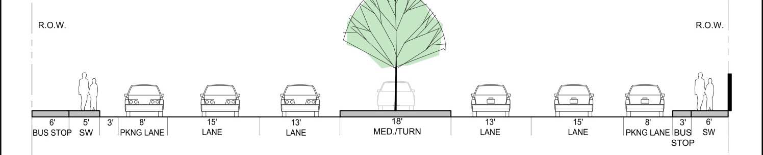
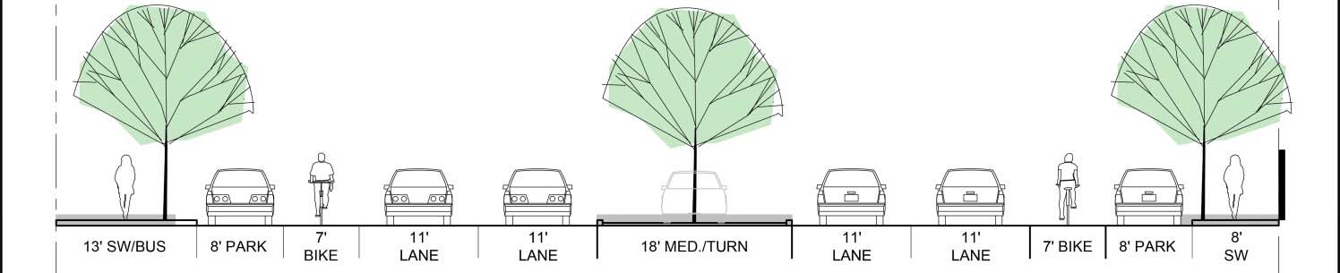
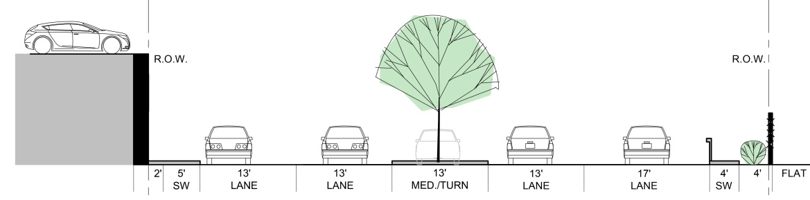
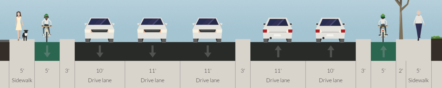
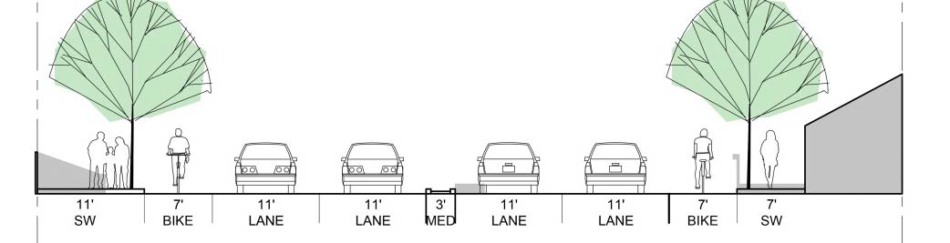
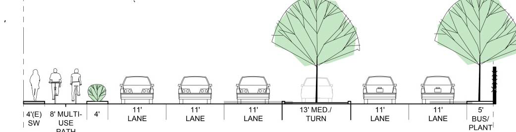
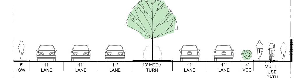
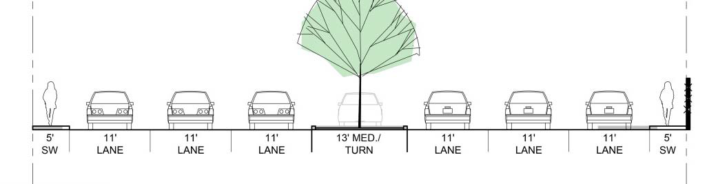
The presentation in October split up Drake into 4 segments: Ross Limits to Broadway; Broadway to Wolfe Grade; Wolfe Grade to El Portal; and El Portal to 101. Each segment’s right-of-way (property line to property line) is a different width, which makes planning consistently difficult.
Nevertheless, I’m unimpressed by the solutions presented. Unprotected bicycle lanes on a 35mph road will simply never be used. This might be excusable if there weren’t space for buffers, but a huge amount of space is dedicated to a center turning lane and median. As well, 11-foot lane widths, though a huge improvement to the 15-21-foot lanes, are wider than a city street ought to be. Lanes of 10 feet should be standard. For comparison, freeway lanes are generally 12 feet wide.
Here are current conditions, the county’s ideas, and my own ideas. Note that despite having protected bike lanes, there are no proposed eastbound traffic lanes cut, meaning the roadway's throughput will remain enhanced where it is most under pressure.
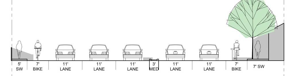
Segment 1: Ross Limits to Broadway
Hover over each of the following to see commentary.
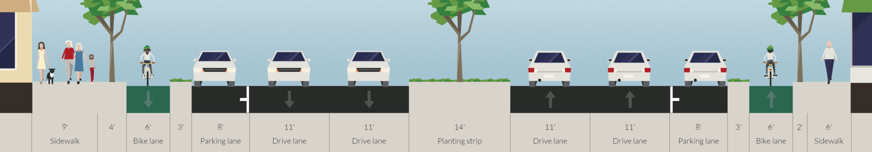
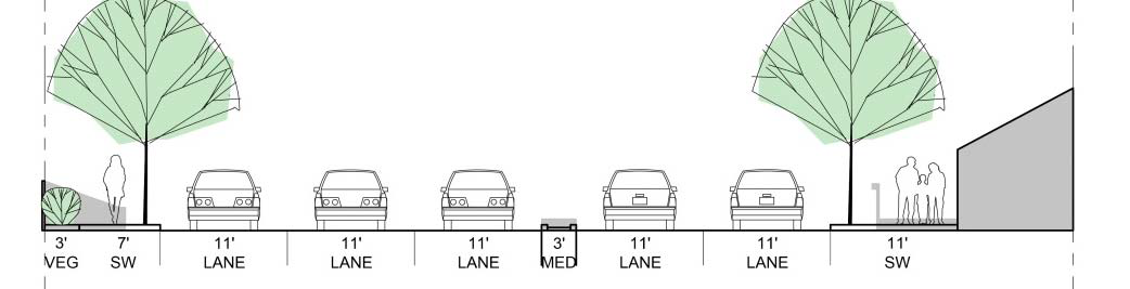
Segment 2: Broadway to Wolfe Grade
Hover over each of the following to see commentary.
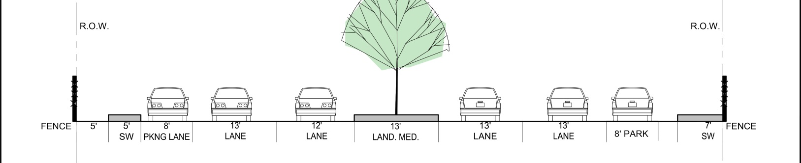
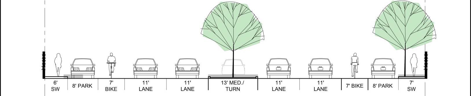
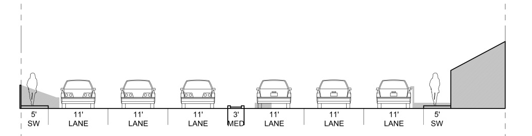
Segment 3a: Marin Catholic
Hover over each of the following to see commentary.

Segment 3b: Bon Air Road to El Portal
Hover over each of the following to see commentary.

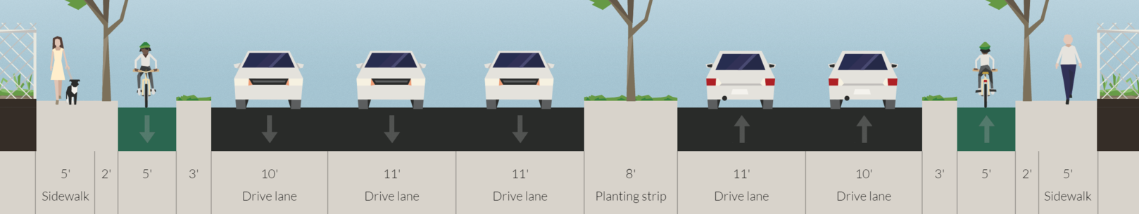
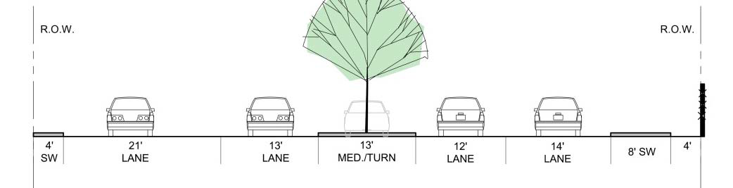
Segment 4: El Portal to Highway 101
Hover over each of the following to see commentary.
Protected bike lanes drive bicycling use
The reason I have added protected bicycle lanes to each segment is because they push for a relatively fantastic increase in cycling use. At the moment, just 1 percent of users along Drake are on bike, probably in part because of how difficult it is to bike along the route. Boosting that percentage even a bit - to 5 percent - could do a lot to cut down on traffic, especially around school times.
Congestion is the result of a tipping point, where the traffic levels rise just a bit too much, causing speeds to fall off a cliff. Taking just a few trips off the road can have an outsize effect on congestion levels. When paired with a wider road, as both the county and I propose, it should do wonders to cut down on traffic. The lanes may also soak up some of the induced demand from driving that occurs whenever a road's capacity is increased, prolonging the usefulness of this improvement.
Intersection Design
For each of the proposals I generated, intersections should be redesigned to allow the easy flow of people in all modes. Check out the full presentation for info on the proposed intersections, which do a great job for pedestrians, but they are insufficient for protected bicycle lanes. I've uploaded some options from the NACTO bicycle guide below.
If you're going to go to the meeting at this last minute - I myself only found out about it today - then get yourself to College of Marin at 7pm, Fusselman Hall 120.
Four visions of a higher-speed Bay Area rail network
The Bay Area is a sprawling region, no doubt about it. It stretches from Napa Valley to Silicon Valley, Pacific Ocean to Sacramento River Delta, is nearly as large as New Jersey or Cyprus. Yet this size means its various economies are disconnected to such a degree that the Census Bureau has split it into two different metropolitan areas.
Dr. Alasdair Rae recently mapped the commuter flows throughout the Bay Area and found it was a hotbed of long-distance commuters, no surprise given this size. While driving is all well and good for some commuting, the resulting traffic means freeways are ineffective at moving large numbers of people long distances at rush hour. Moderate to high-speed rail is the only solution that can provide a reliable and fast commute to stitch the region into a unified whole.
Adapted from the Asian Development Bank, Changing Course in Urban Transport: An Illustrated Guide.
The basic map created by Dr. Rae is what he calls a “desire line” diagram: it draws a line between every census district that has 50 people or more commuting between the two. It can be the backbone of a new HSR system.

Image from Dr. Alasdair Rae. Click for his write-up.
To my eyes, it's clear there are some major commuter axes. The primary center is doubtless San Francisco. The secondary centers are Oakland, Fremont, Silicon Valley, and San Jose. Tertiary centers are San Rafael, Santa Rosa, Napa, Fairfield, Richmond, Walnut Creek, and Livermore/Pleasanton. The corridors that link these together are prime candidates for higher-speed rail, with a top speed of 125mph and average speeds around 50mph, depending on stop spacing.
Four people – me, @TaupeAvenger, @aSmallTeapot, and @UrbanLifeSigns – took a turn drawing what might be an effective railway system based on the above. Each assumes Caltrain’s new electric trains will be standard throughout the system. BART, with its top speed of 80mph and 33mph average, will stay in place in each scenario.
My own plan focuses on the North Bay and the core:
The Edmondson Plan
This plan serves the North Bay commuter corridors at the expense of the South and East Bay. These corridors were better served by expanded lower-speed rail service, more akin to BART than the fancy moderate-to-high-speed rail service I envisioned. Gray lines here indicate moderate-speed connections between the twin branches.
TaupAvenger's plan:
The Taupe Plan
Taupe, too, focused on northern branches to Santa Rosa, Napa, and Sacramento and left the East Bay for another system, but he added a new rail crossing from Oakland to San Francisco, presumably using the Sacramento line. Particularly quirky is that the Napa line proceeds to San Francisco via San Rafael rather than Vallejo. Presumably, commuters from Napa to the East Bay will either transfer at San Francisco or utilize lower-speed transit.
Teapot's sketch went the extra step of labeling the lines:
The Teapot Plan
Unlike the Edmondson or Taupe plans, the Teapot plan includes a high-speed rail connection through Diablo Valley, though that line begins at Napa rather than Vallejo. Also of interest is that San Francisco lies only on Line 1. Even Marin, whose out-commuters tend to be destined for San Francisco, only get a BRT line to The City. On the upside, central cities are poor places for line termini, so running the line through Transbay Terminal makes a lot of sense.
Finally, Urban Life Signs sketched out this plan, including BART-speed segments (green) and California's statewide HSR (outline):
The Urban Life Signs plan
This system is more or less my own, with a key difference in that it includes San Jose-Diablo Valley service and a moderate-speed connection to Stockton. Placing the end of the Diablo Valley line at Walnut Creek may not make for the most attractive network, but it does serve the commuter flows best (notice the lack of commuting between Solano County and central Contra Costa in Dr. Rae's data).
At average speeds of 60mph, including time stopped at stations, these plans still won't allow a commuter to easily go from, say, Santa Rosa to San Jose in much less than 1:45 but it would be far more reliable than a car journey that same distance at rush hour. And it would be a huge improvement to the current transit system, takes 4:06 for the same journey.
A principal problem with our transit system is that our region lacks the hierarchy of transit service that it has in its road system. We have our local service (buses), arterial service (light rail) and expressway service (BART) but we lack good intercity highway service (high-speed rail). As a result, long-haul commuters must turn to cars and jam our roads.
So while these HSR plans may be rough and fantastical, and would be quite expensive, they do present a future that is worth considering.

Unbundling parking isn’t simple, but it’s worth it
Municipal parking policies were not created with bad intentions, or without some thought. Though they have evolved into somewhat mindless orthodoxy, they do still serve the purposes of managing parking supply. Undoing this supply-sided management scheme in favor of a demand-sided management scheme is not a simple task.
Unbundling parking, which involves separating the cost to rent a parking space from the cost to rent an apartment, is one vital tool in managing parking demand. To be effective, though, it will need to address the same issues bundled parking addresses.
So how might a city cope with the concerns opponents will raise when considering unbundling parking?
Parking will overflow into the streets!
This is a real concern. Parking minimums were originally enacted to stop drivers from taking over neighborhood streets. Simply abolishing them today without concern for the consequences would be wrongheaded.
The basic concern, ensuring neighborhoods near to downtown don’t get overwhelmed, is resolved by a residential parking permit program. The city gives or sells residents the right to the street parking in their neighborhood and also grants them the ability to temporarily give permission to their guests. All others are either strictly limited in how much time they can spend in a given space or are banned from parking in that zone entirely. To target the program more narrowly, perhaps dwellers of new apartments could be barred from receiving parking permits.
It will become impossible to park downtown!
With all of downtown’s parking demand now squeezed into its own borders, the city will have to get creative to manage it.
While the first impulse is to boost parking supply, generally parking problems are a result of poorly managed demand. Studies into the view that there’s “nowhere to park” have found that sentiment to generally be illusory. Even in Tiburon, a study into their downtown’s parking problems found that there was more than enough off-street parking to handle demand; people simply weren’t looking for it.
In San Francisco, their SFPark program addressed the issue with price signals. They lowered the price of parking in their garages, which were generally underutilized, and on low-demand side streets and raised the price of parking in high-demand main streets. Even though some prices went up, overall the average cost of parking declined and street spaces opened up.
Paired with this demand-based pricing – which would have as its goal one open space on each block – should be transportation demand management policies. These policies, proven effective in communities across the country, are designed to reduce driving and therefore parking demand. Reduced ZipCar memberships, taxi or Uber discounts, transit discounts, and bike-supportive services and infrastructure are all proven to reduce demand for parking.
In short, building new supply should be the last thing a city tries. It shouldn’t be taken off the table entirely – no tool should be – but managing demand is much cheaper and effective than shelling out $50,000+ for a new parking space. Once the cost/benefit ratio of adding new parking is greater than the ratio of demand management schemes, supply should be considered, but with care: each parking space will be one or more new trips to the garage on roads that might already be clogged.
Low-income people won’t be able to afford a parking space!
Sometimes, a family does need a car. Herding a gaggle of kids onto a bus isn’t terribly feasible, and commuting to, say, Oakland by transit just doesn’t work on a daily basis. But with parking spots going for upwards of $600 a month, a low-income family might not be able to afford it.
The simplest way to approach this conundrum is to determine the ratio of how much a parking space costs to rent to how much an apartment alone costs to rent, both at market value, and to apply that same ratio to the affordable apartment rent. Okay, that sounds less simple that it did in my head, so here’s an example.
Let’s say a market rate two-bedroom apartment goes for $2,400 a month alone and the attendant parking space costs $600 a month. Together, the market rate for this place is $3,000: 4/5ths going to the apartment and 1/5th going to parking. Since the building has unbundled parking, the $600 is an optional add-on.
Now, let’s say the maximum rent a very low income family can afford for a two-bedroom is $1,200.* If we apply the same ratios as before, the family should be charged 4/5ths of their rent for the apartment itself and 1/5th for the parking. Since this building also has unbundled parking, they are charged a maximum of $960 for the apartment (4/5ths of $1,200) and $240 for the parking spot (1/5th of $1,200), meaning the most they would pay is still the most they could afford.
While $240 still sounds like a lot to charge per month, consider it in the reverse. While a low-income family may want a car, they might want the $240 per month more. Bundled parking makes that choice for them; unbundled parking allows the family to make that choice for themselves. And, even if they do choose to take the parking spot, they won’t be paying more than one-third of their income.
You just irrationally hate parking!
No, I just really hate unnecessary traffic, and I hate it when government makes choices for people. Bundled parking, an outgrowth of the latter, causes the former.
Donald Shoup, professor of urban studies at UCLA, has said that free parking is like a fertility drug for cars. It removes the price signals that tell people maybe there’s a better way to move around and creates a shortage of the road space and parking required to support car trips.
As with any goods shortage, this means that what people don’t pay in money they pay in time: time spent in congestion, time spent hunting for a space, time spent walking from wherever that space was found. As IJ columnist Dick Spotswood observed recently, population density in and of itself doesn’t cause traffic. It’s the number of cars those people own, and how often they use them, that causes traffic.
This means the people who really do need a car, like the family with the gaggle of kids, the contractor heading to a job, or the long-haul commuter trying to get to work, will get stuck behind people who really don’t need a car but have one anyway, all thanks to decisions made on their behalf.
San Rafael and other cities should look carefully at how they manage their parking supply. If they stay on the same path, they will only make more problems for themselves and residents.
*It’s actually $1,138 in San Rafael (PDF), but I’m rounding up for the sake of example.